Welcome to the highly anticipated continuation of Erin’s Picks! If you joined us for the first part, you know we’ve been working on something extraordinary—Creative Curations by Erin! (And yes, that’s me!)
Creative Curations by Erin is a brand-new product line within the Creative Materials umbrella, offering collections that transcend the usual seasonal trends. These curated collections are designed to be the standout, bespoke elements that add that special touch to your designs—think Instagram-worthy focal points of your projects.. Today, I am excited to reveal more of these unique collections in the second part of this multi-part blog series. As part of Creative Curations by Erin, you’ll now find two exclusive collections from Mutina.
Let’s explore the concepts and intricate details that make these new additions truly exceptional.

“Creative Curations by Erin – A blend of exclusive collections, elevated design, and artistry for unique spaces and visions. The Creative Curations product line is thoughtfully selected by trusted interior designer Erin DeMuth, renowned for her Erin’s Picks blog, ability to identify trends, and intricate knowledge of surface materials.
Creative Curations is designed to evoke inspiration for spaces such as exclusive retail, luxury, hospitality, fine dining, exclusive and private clubs, boutique corporate offices, luxury amenities, bespoke lobbies, leisure spaces, and more!”
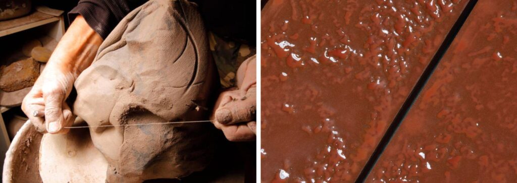
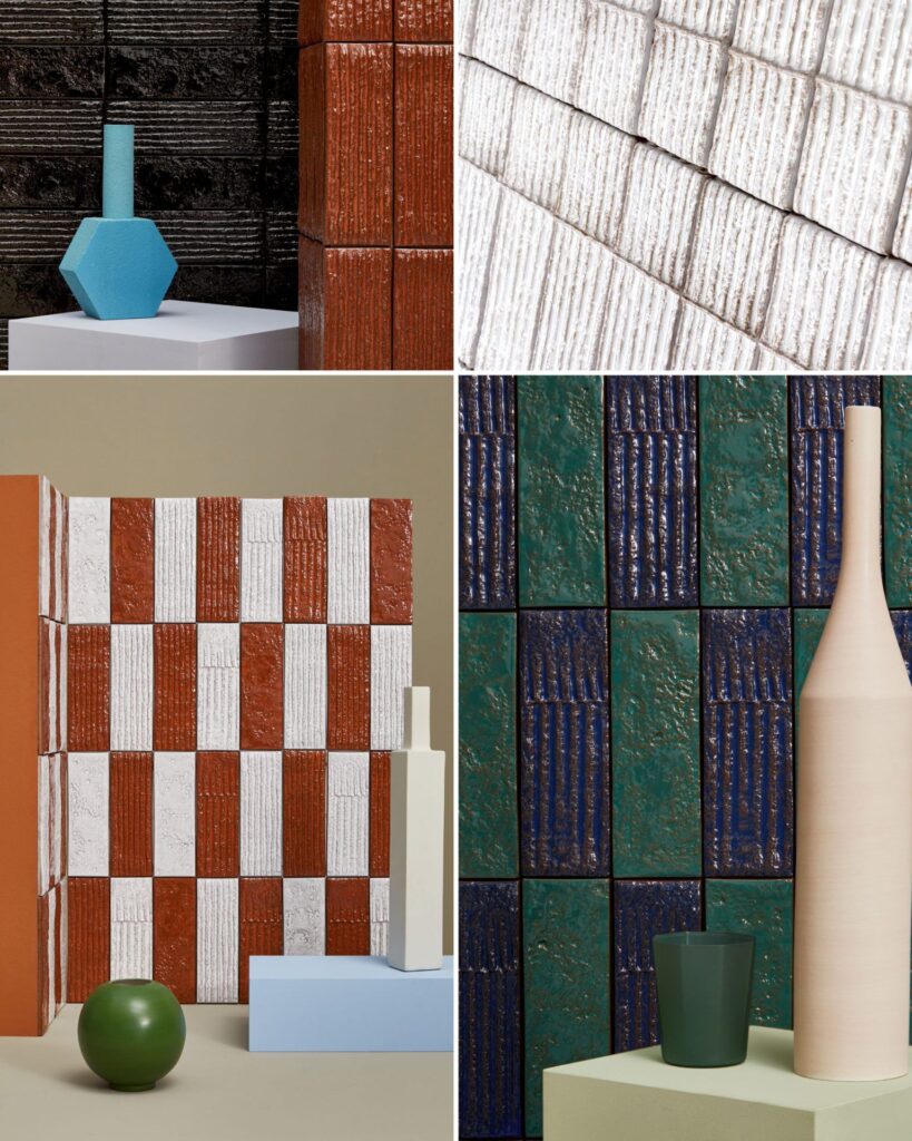
CONCEPT – “Chamotte collection comes about from the desire to design an element with great tactile consistency, that highlights the brutal and natural beauty of ceramics. We have worked on volumes, creating a surface full of layers and contrasts, both to the eye and to the touch.” – Patricia Urquiola
Chamotte, which takes its name from the raw material made of crushed ceramic fragments embedded in raw clay to strengthen ceramic mixtures, is also a collection focused around color and how it reacts with the surface of the clay. The glaze colors used in Chamotte are typical of those used in ceramics. The glazes are buildable and react differently to the high and low points within the tile. You will see moments where the glaze just slightly washes color over the surface of the tile, yet in other instances you will see areas of highly concentrated color – these are the low points where the color pools.
I love the raw beauty of this collection and its study of ceramics and glazes in their purest form.
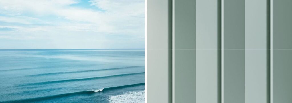
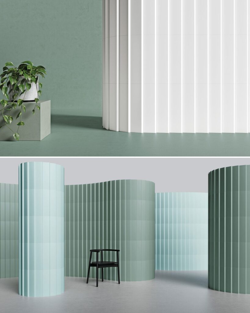
CONCEPT – Inspired by the way in which waves merge with one another. Each tile simulates the fluid crest and trough of a wave.
I love how this collection captures the dimensional characteristics of a wave along with its colors. The color palette reflects the colors found at various stages of a wave – white is the crashing of waves against the shore, mint is the shallow water a few feet from the shoreline and green is the deeper water just beyond. Use this tile to create a unique sculptural rhythm in your space.
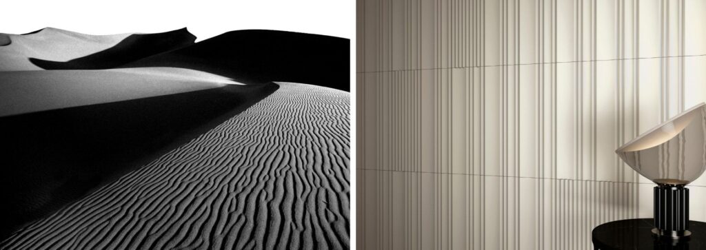
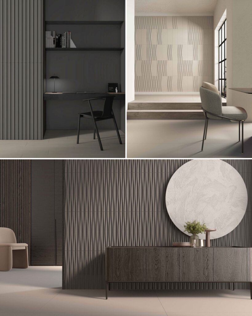
CONCEPT – Inspired by nature and the geometry it creates. You will see gentle folds, subtle inclined planes, and curving forms that are capturing the movement of the mountains, the wind-swept desert, the sculptural rhythm of grass in a field, to the waves of the ocean.
To complement these architectural-like reliefs, Cast’s color palette is a range of warm and cool neutrals, so they do not detract from the sculptural beauty of this tile.
Another cool feature of this collection is combining different reliefs together or a relief and a flat together that can add moments of intensity to the design or can allow the reliefs to soften and fade out.
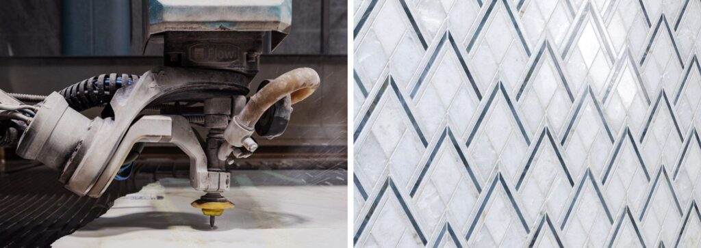
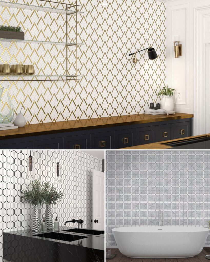
CONCEPT – A natural stone mosaic collection inspired by the waterjet cutting process, but instead of traditional looks, this collection features contemporary designs inspired by angular, geometric and even art deco inspired motifs.
Keeping inline with the contemporary designs, the marbles used in this collection focus on the following colors: white, grey, and black. Some of the mosaics incorporate glass and metallic elements like silver and gold to elevate this collection even further.
Check out my favorite design Link for a chain link like effect. It also reminds me of cartoon eye balls. 😉
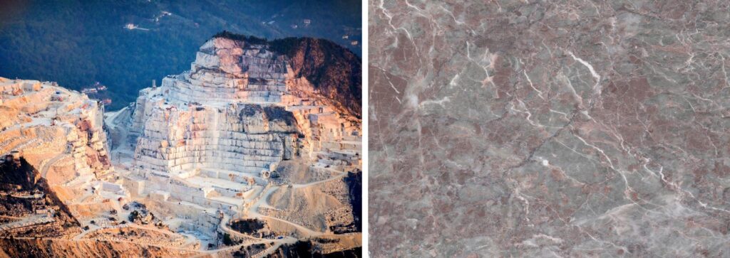
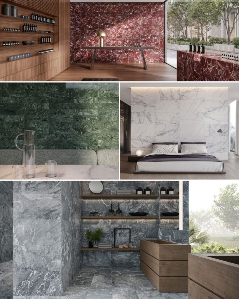
CONCEPT – Inspired by the beauty of nature, this natural stone collection offers a wide range of marble colors, finishes and dimensional textures. The marbles found in this collection feature classic colorways like white, beige, grey and black, but also include some of the more bold and trending colors like green, red and blue.
Natural Stone is a new product category for Creative Materials and we’ve incorporated a care and maintenance guide for this material in the download section of this collection.
The highlights of this collection are the dimensional tiles – Ribbed, Fluted and Pyramid – these dimensional textures are seen in furniture details and I love how they are not being incorporated into stone to add even more elegance to such a unique material.
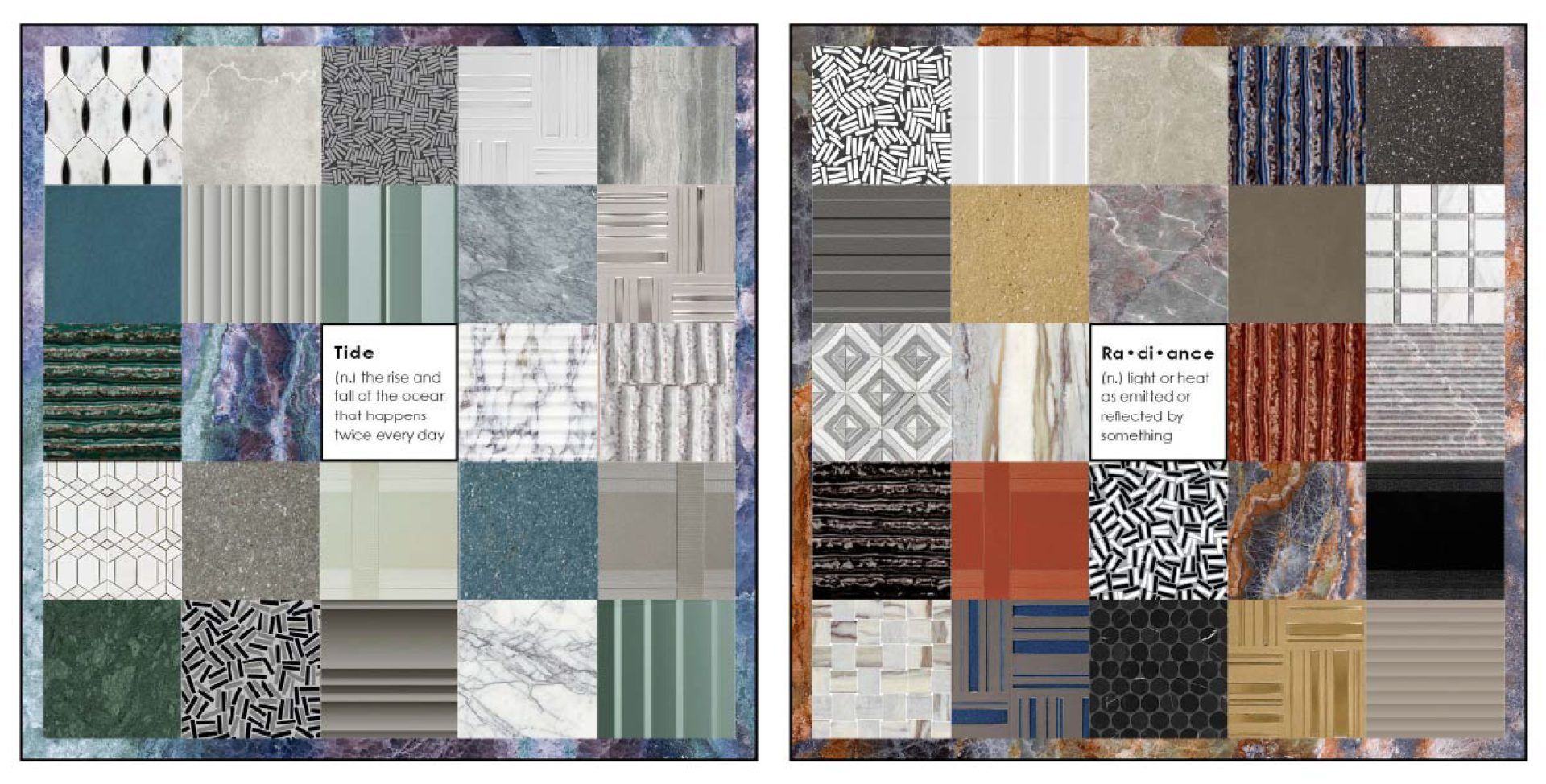
When I started creating the collection palettes for Creative Curations by Erin, my brain immediately began dividing the collections into these two combinations/themes shown below – Tide & Radiance. They feel like polar opposites to me – Tide is a very calm and soothing quality, while Radiance has a bold, dynamic energy to it. And maybe I’m drawn to these because they are reflections some elements of my life right now, my personal life vs. my professional life. My professional life feels like the Radiance palette where I want to keep growing and do more within Design Services and our Product Launches to help and education the design community, which is definitely a passion of mine. My personal life feels more aligned (or at least I’m trying to align it) to the Tide palette because I’ve started to turn my home into that mental break I need from the daily grind, and the things that are helping most with that is slowly starting to decorate our new home and creating some new gardens from scratch. The gardens at times have been overwhelming, but the thing that is starting to ground me and help me focus on my selections is my color theory knowledge of complementary colors. Ever since high school art class I’ve always leaned towards the yellow/purple pairing, so I used that as my base color palette for my pollinators garden, and I’m very excited to see how it grows and comes together.
I love the emotional ties color can have on a person. To this day, the types of stories we can tell with the colors we select still amaze me. I hope the collection themes I’ve created below evoke a certain emotion within you and helps guide your next design story.
If you would like to see these collection and learn more about them, please contact your local A&D Consultant. You can also check out the Instagram Live I hosted on Tuesday, June 4th on Creative Materials’ page – @creativematerialscorp – where I dived into some of my favorite details from these collections.
Follow me on IG @creativecurations_erin
Until next time…
E