Welcome to the highly anticipated continuation of Erin’s Picks! If you joined us for the first and second part, you know we’ve been working on something extraordinary—Creative Curations by Erin! (And yes, that’s me!)
Creative Curations by Erin is a brand-new product line within the Creative Materials umbrella, offering collections that transcend the usual seasonal trends. These curated collections are designed to be the standout, bespoke elements that add that special touch to your designs—think Instagram-worthy focal points of your projects.
Today, I am excited to reveal the final part of this multi-part blog series where we will focus on Design Explorations tailored around the collection theme of Tide & Radiance. In these explorations you will see how these collections can be used together to create truly unique spaces.
Let’s look at the materials and stories behind these Design Explorations…

“Creative Curations by Erin – A blend of exclusive collections, elevated design, and artistry for unique spaces and visions. The Creative Curations product line is thoughtfully selected by trusted interior designer Erin DeMuth, renowned for her Erin’s Picks blog, ability to identify trends, and intricate knowledge of surface materials.
Creative Curations is designed to evoke inspiration for spaces such as exclusive retail, luxury, hospitality, fine dining, exclusive and private clubs, boutique corporate offices, luxury amenities, bespoke lobbies, leisure spaces, and more!”
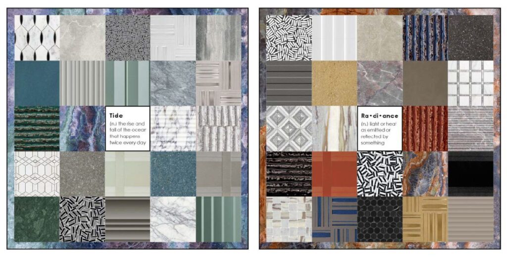
When we kicked off Creative Curations by Erin in June, we discussed the theme of the collection – Tide & Radiance.
The colors within each collection gravitate towards this theme and are reflected in its collection palette. You will see soft, calming blues and greens that capture the tonal beauty of the ocean tide and the characteristics of its movement. These colors juxtapose the bold and radiant reds, oranges, and yellows also found through out various collections. These colors can be mixed to create a bold statement in your space or the complete opposite.
In the Design Explorations, you will see a space that uses both the Tide and Radiance color palettes. These Design Explorations do exactly that, they explore color, pattern, textures and shape in an interior space. The Tide space will focus on a color palette of soft blues and greens paired along side dimensional details to create a space that is calm and soothing like the beach. While the Radiance space will focus on bold graphics, textures and colors to create a space that exudes maximalism.
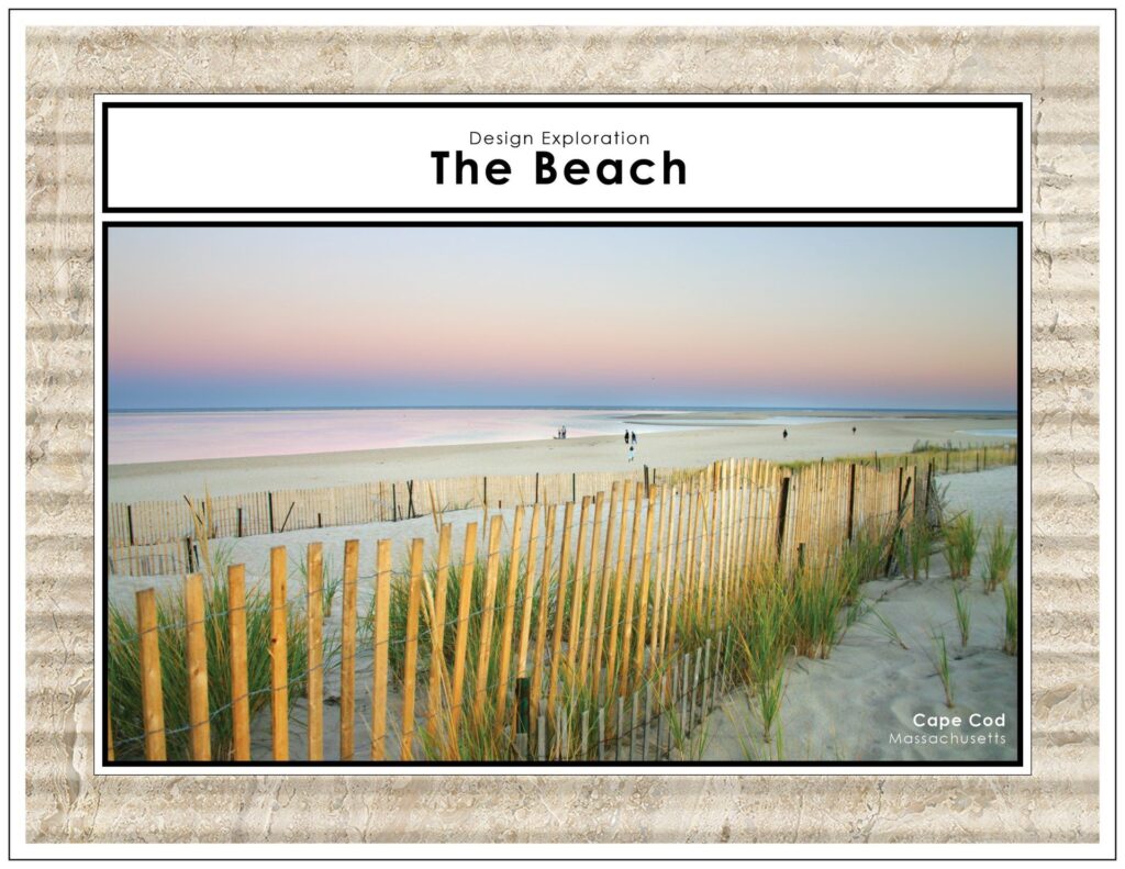
In this Design Exploration, I’m drawing inspiration from one of my happy places, the beach. One of my fondest memories was going to the beach near my grandparent’s house in Madison CT. The beach we went to had the best rocky area that during low tide exposed a million little pools of water where we would try to catch crabs using gum drops or salami (FYI – this is when my love for cured meats began.) I don’t remember catching much, but we had a blast.
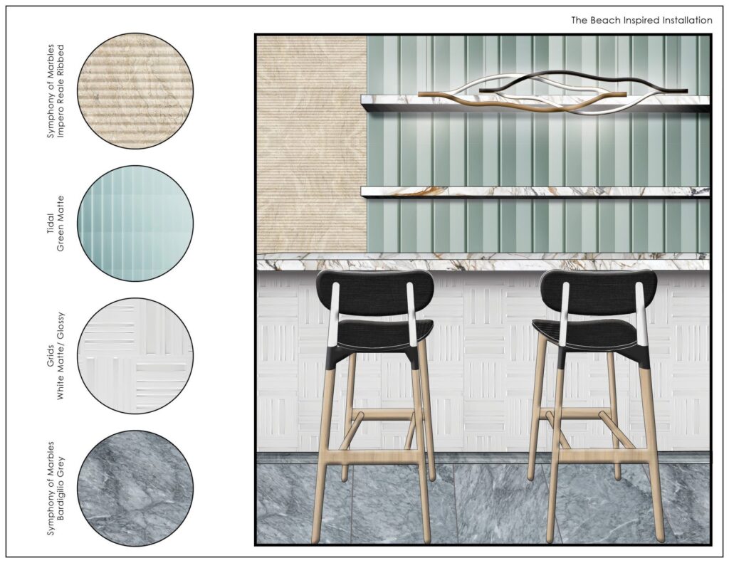
The beach has always been a place that was very calming and relaxing for me, it’s the one place where I feel like I can really disconnect from my phone and other distractions and just truly be at peace, it’s an incredible thing. Since the ocean has been a theme through a couple of Creative Curations by Erin collections, I thought it was only fitting that I dedicate a Design Exploration to the beach and use materials that reflect the look, feel and movement of the beach and ocean. Symphony of Marbles is the perfect natural material in both aesthetic and texture to capture details like the sand and water; Grids captures the repetitive linear and grid like movement of the fences that line the beach; and Tidal reflects both the color of the water as well as the undulation of the waves.
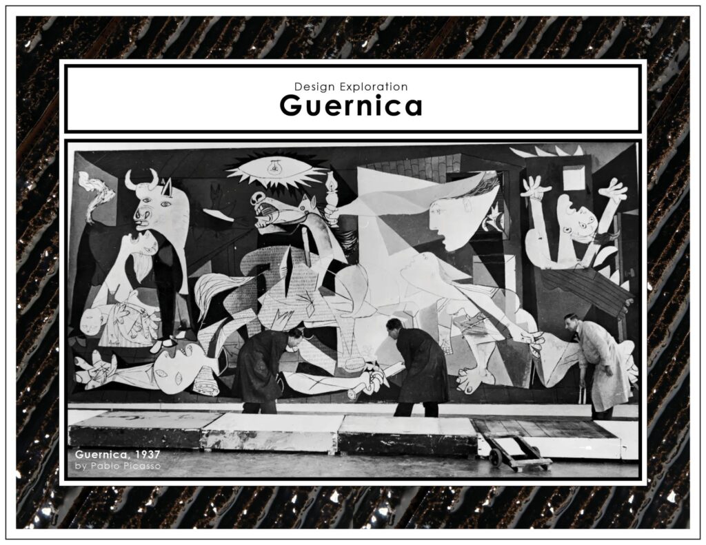
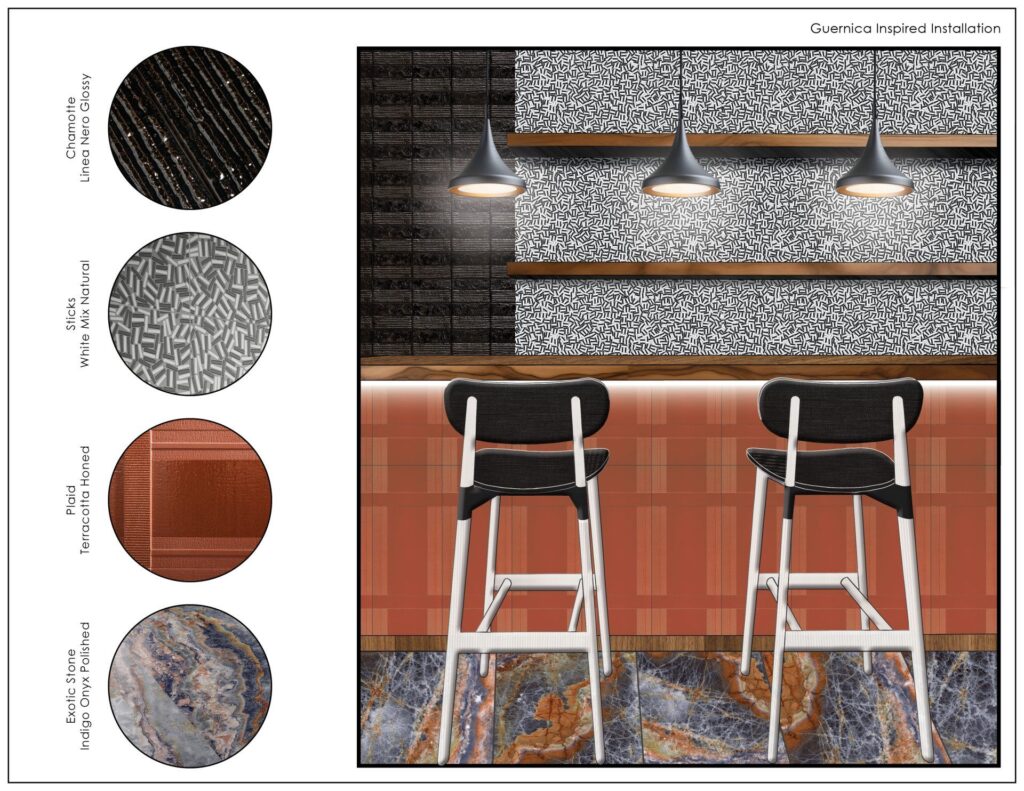
In this Design Exploration, I’m drawing from the same inspiration used in my first studio project at Wentworth Institute of Technology for this first design exploration. Our project was to design a dining space. I used Picasso’s Guernica as the inspiration. Capturing the same sharp angles that cut through the piece as the basis of my layout this was reflected in the floor plan, reflected ceiling plan, and other details in the space. For this design exploration, I wanted to capture this piece’s raw and chaotic emotion in the materials I used. Immediately, I gravitated towards the Creative Curations by Erin collections that reflected this. Sticks for its angular movement and nod to the color palette of Guernica; Chamotte for its raw beauty and brutalist-like nature; Exotic Stone for its dramatic, fractured visual that is reflected in Picasso’s work; and Plaid for its textural depth that is seen within the figures and linework in Guernica.
If you would like to see these collection and learn more about them, please contact your local A&D Consultant. You can also check out the Instagram Live I hosted on Tuesday, June 4th on Creative Materials’ page – @creativematerialscorp – where I dived into some of my favorite details from these collections.
Follow me on IG @creativecurations_erin
Until next time…
E