I feel like grout can be a touchy subject, some love it, some hate it, but I want to take this time to explain why you should love it, and why it should look at grout as the paint to your tile canvas.
We’ve been seeing this trend with grout: treating it as a form of art within the tile pattern by using bold, contrasting colors or even playing with the size of the grout joints themselves. When I’ve been out with some of our A&D consultants talking about grout, I’ve referenced the show Beef.
Most had not seen the show, but since Beef has won a ton of awards, from Emmys to Golden Globes, I’m thinking more people have watched it and may now understand the scene I’m referencing when talking about grout.
(And also, if you haven’t seen the show, you should because it’s frickin awesome!! Steven Yeun and Ali Wong are fantastic and congrats on your well-deserved awards!)
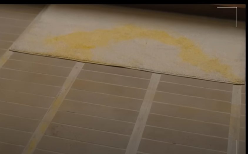
So, the scene I reference when I talk about grout is THE BATHROOM scene, this is where the beef Amy (Wong) and Danny (Yeun) have with each other is taken to the next level. Here’s a clip of that scene…
If you look beyond the pee, you see those gorgeous, sexy, architectural-like grout joints, am I right?! And then my brain is like, oh, that’s got to be Mood! I guess this thought process is probably just limited to me and my uber-geeky tile brain. Still, I know my fellow designers will agree that when they walk into a space, the first thing they are looking at is its design and the details and materials used to create the space.
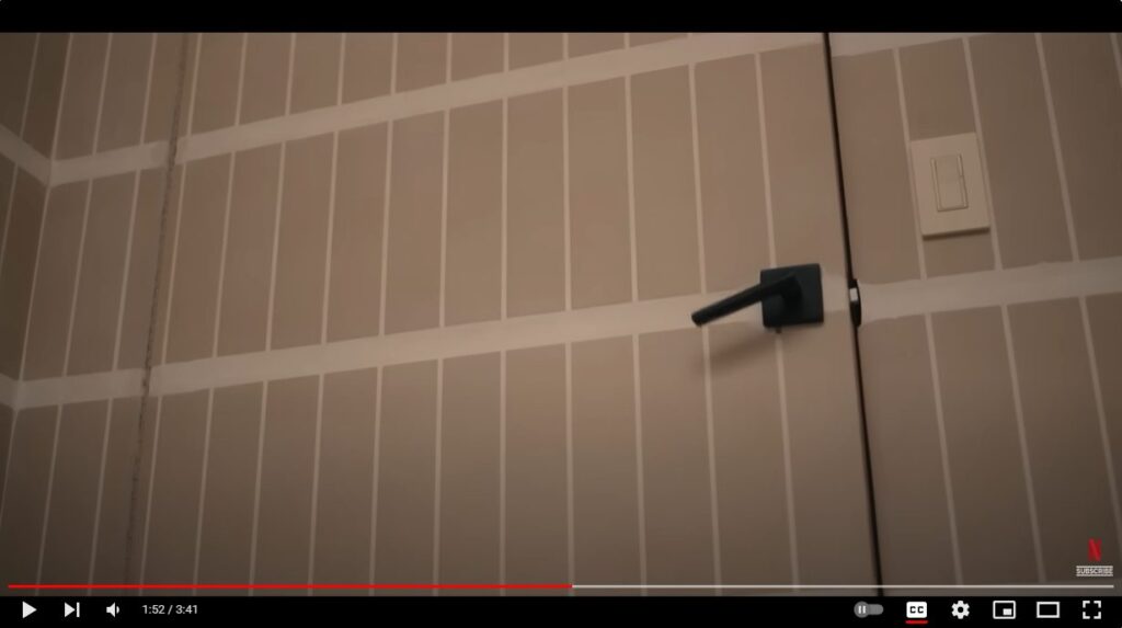
I have a feeling the last thing Yeun and Wong thought someone might say about this scene is ‘OOOOO, look at those grouts joints !!’
So, we just looked at how playing with the size and scale of tile grout joints can make a bold statement in your design. Let’s look at how the color you select impacts the design. I think our Colorform collection does an excellent job taking cool designs and elevating them even more with thoughtful grout colors – truly making these spaces works of art.
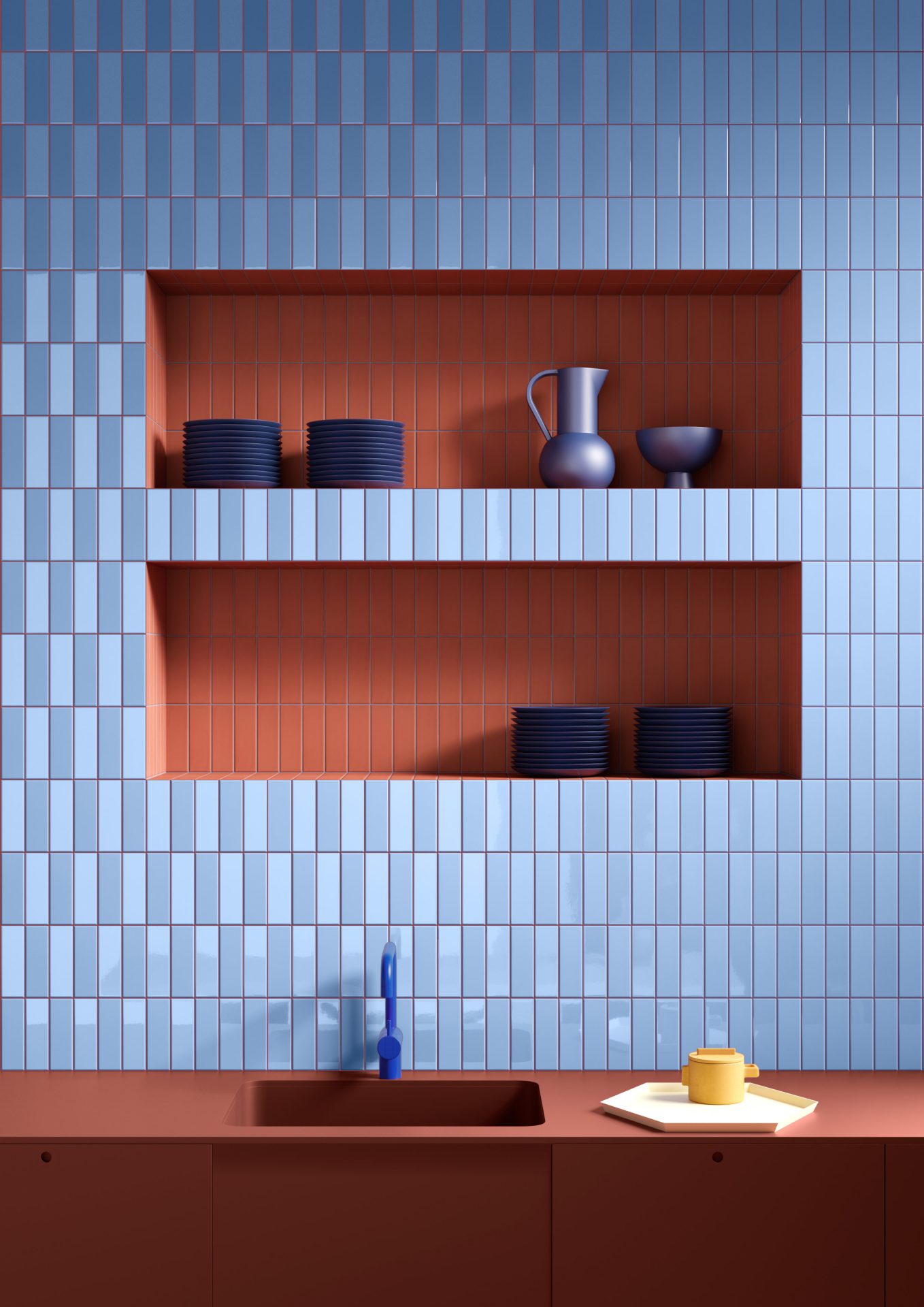
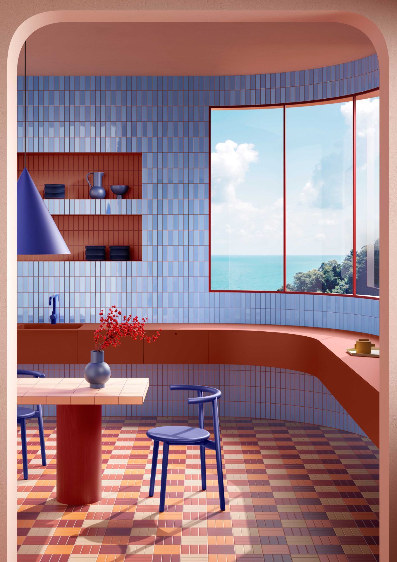
Opposites Attract – I love how they brought a terracotta colored grout through the Sky Blue Matte/Glossy checkerboard and once they hit the Cinnamon tiled niches they switched to a Sky Blue colored grout.
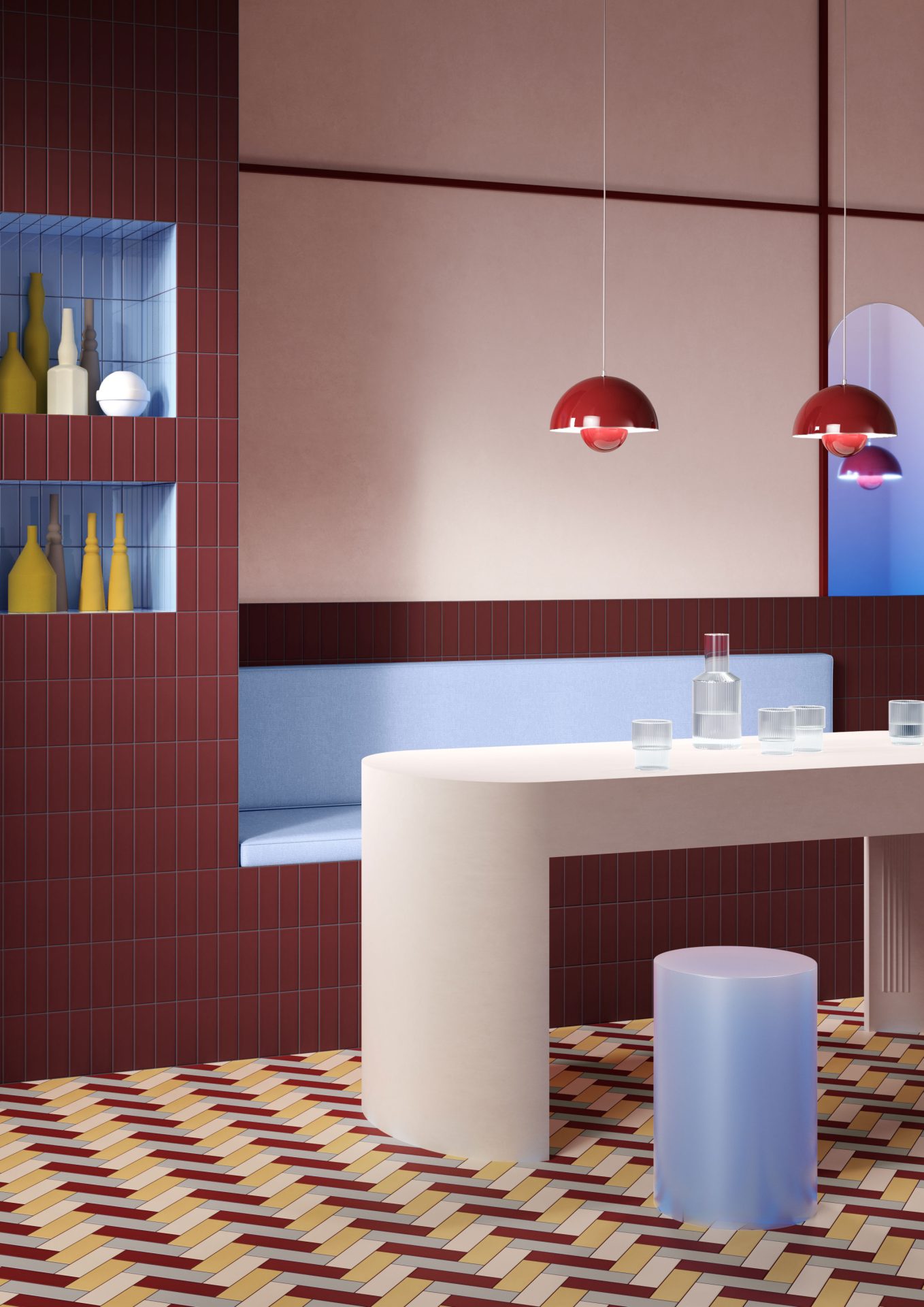
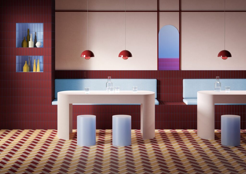
Ron Burgundy would love this – If I could pick a color palette to describe Anchorman this would be it. This installation gives off a 1970s vibe and I love the use of the burgundy grout through the herringbone pattern and up into the Sky Blue tile. They could have chosen to continue it through the Burgundy tile, but what fun is that? Instead they chose to contrast and pull in the Sky Blue, the same color used in the upholstered seat cushions.
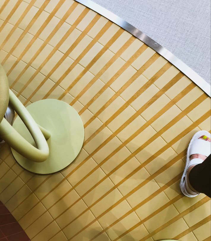
Here’s one last example of a play on grout joint width and color. This layout was in the booth where we found Colorform, and yes, that’s my foot for scale (I’m a size 9). They had a radius bar and fanned Colorform mustard out around the perimeter. As you can see, this resulted in the joints widening as the tile flared out, creating this sunburst effect. Instead of hiding the wide joints with a similar yellow, they accentuated them with an even deeper mustard/ochre grout color.
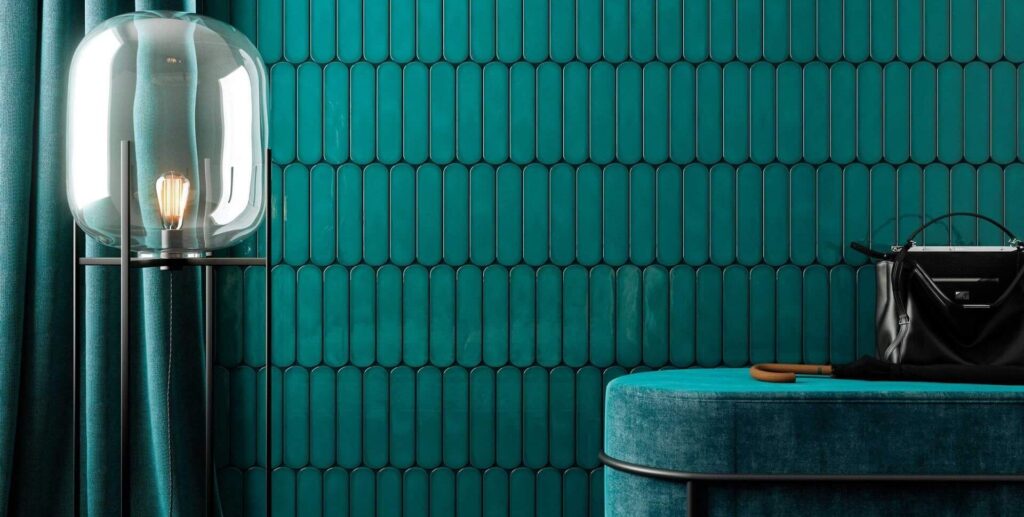
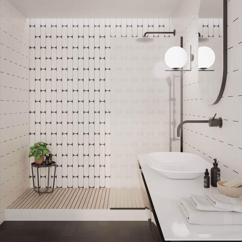
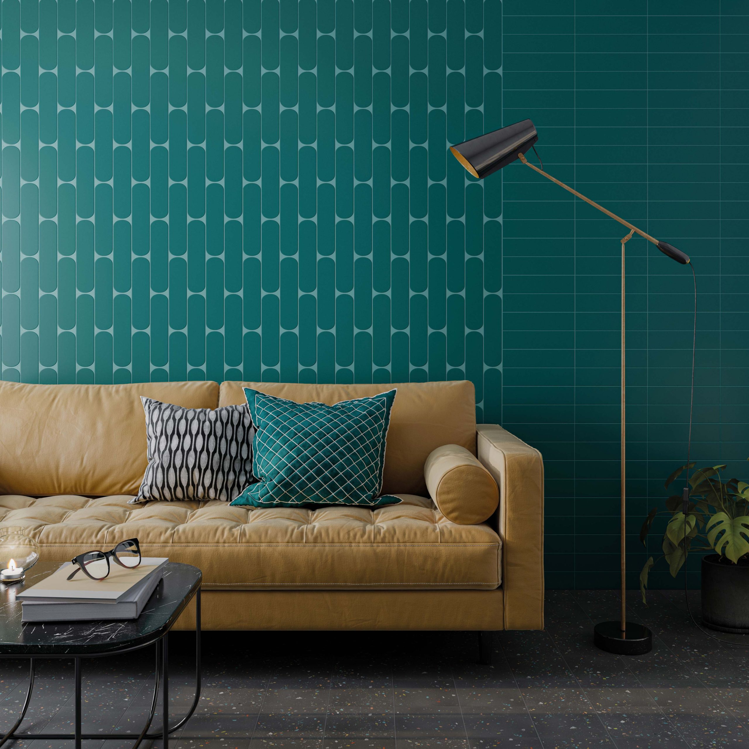
Check out our Perspective collection if you’re looking for more examples of unique grout joints and using grout as the paint for your tile canvas. This collection features a unique oblong shape, and depending on how you lay the tile out, the grout joint can create a starburst or scalloped-like effect. I highly recommend adding a contrasting color to this tile to elevate its design.
Well, you’re in luck because we can help with that. Just contact your local A&D Consultant, and we can schedule a quick call to discuss how we can help provide you with a custom grout color that will make a statement in your space.
If you would like to explore incorporating bold grout joints, ask your dedicated A&D Consultant to meet with the Design Services team to discuss how we can incorporate some grout art into your design.
Until next time…
E