
There were a lot of great looks at the show, too many for just one blog post. So, this month I’m going to explore the rest of the looks we saw. There were some surprises: typical aesthetics we see year to year didn’t have much of a presence and some aesthetics that we thought drifted away, are back.
(Just a note, some of the products that you see below are new at Coverings and usually take a couple months to be produced.)
Terrazzo continues to have a presence within the Italian manufacturers and the aesthetic continues to evolve with interesting colors and aggregates. I thought we would have seen more US manufacturers with Terrazzo aesthetics, however, like fashion, I think it might take another year or so before we see this aesthetic produced stateside.
ARTISTIC TERRAZZO
This terrazzo has artistic written all over it, from the color palette to the scale and look of the aggregate. The color palette of this terrazzo once again illustrates the color theme we saw at Coverings, muted and saturated colors.
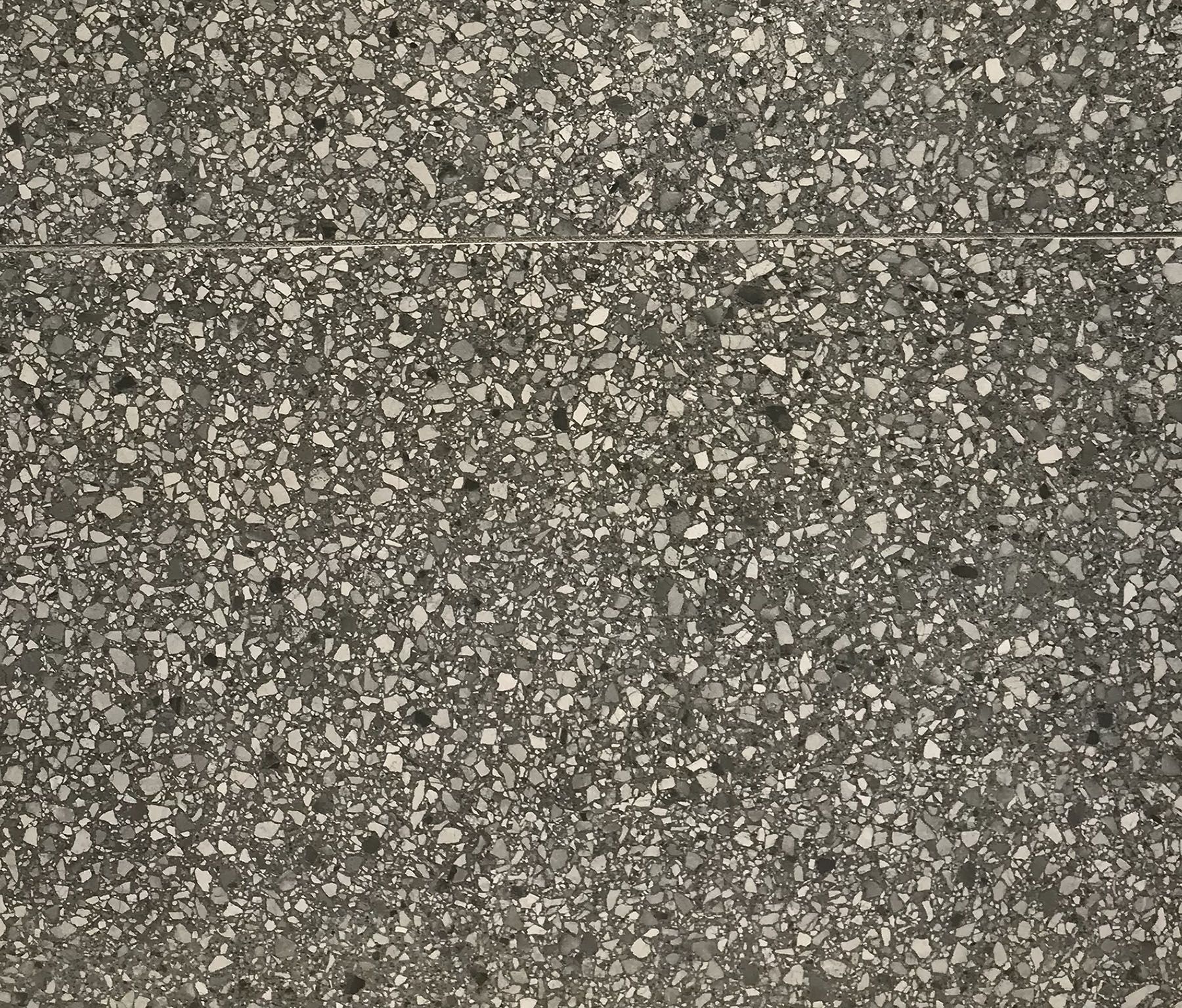
BLACK, WHITE, GREY TERRAZZO
This domestic terrazzo collection took a classic color approach, utilizing black, white and grey in its color palette. Begosso from our 2017 Fall Winter Collection, illustrates a similar color palette, with some slight differences in the aggregate colors.

I combined Concrete + Metallics because there was some overlap within these aesthetics, and this might come as a surprise, but there really weren’t that many concrete aesthetics. The concrete aesthetics we did see brought some new elements that we haven’t seen in the past.
Interesting metals took center stage as well this year. We usually see them sprinkled in here and there, but this year, they definitely caught our eye with interesting textures and formats.
CONCRETE BLOCKS + TERRACOTTA
This collection is composed of a couple elements: concrete blocks, colorful terracotta aesthetics and encaustic patterns (not shown).
The aesthetic below reminds me of a concrete block wall that once had another finish over it that wasn’t completely stripped off, remnants of plaster or mortar sit on its surface and in the concrete pores. Its edges are slightly chipped and ragged to reflect its age. To complement the concrete block aesthetic even more, this tile is in a 8’x16′ format spot-on with real CMU blocks.
The second part of this collection is an aged terracotta-like aesthetic with a jewel tone palette. The peacock blues below were stunning, along with the red wine color, black, brown and off-white, in square and hexagon formats.
METALLIC CONCRETE
This collection has a surface finish which leans more metallic in my opinion, even the color palette reflects that of a traditional metal collection with the silver gray, dark gray and bronze/copper colors. It’s interesting organic patterns transform and shimmer when light grazes across its surface; lighting is key with this tile.
OXIDIZED METALS
Oxidized metal looks, like our Improvise collection, have been around for quite some time, but as the technology and production of tile advances, so do the aesthetics. The visual on this oxidized metal is well done. This collection has also taken some artistic license with the colors, my favorite being the soft green patina on the copper.
Thank you for checking out this two part series on emerging looks we saw at Coverings 2018. We are excited to show you the latest and greatest aesthetics in the tile industry.
Keep an eye out because our 2018 Fall Winter Collection will be coming out very soon! Until next time…