
Happy November everyone! I hope you all had a great Thanksgiving! I can’t believe December is basically here and I’m way behind on my Christmas shopping per usual.
Oh, and if you recall my September/October post, I was going as Ms. Janet Snakehole for Halloween. Here’s a picture of my finished look/costume →
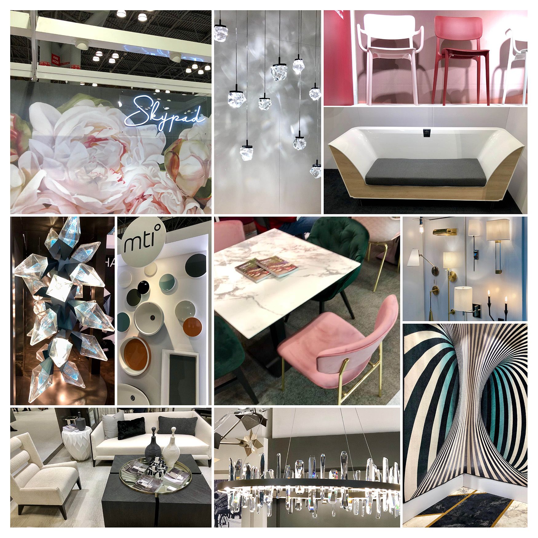
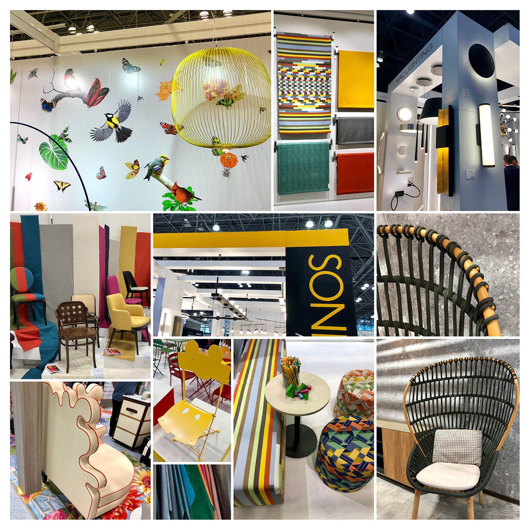
Early this month I attended BDNY with our Director of Marketing, Jenn Barbic. This was my first time attending BDNY. If you’re not familiar with BDNY (Boutique Design New York) it is a trade fair and conference for hospitality design professionals. There are hundreds of manufacturers showing design elements for hotels, restaurants, clubs & spas, cruise ships, and senior lifestyle interiors. The show also offers CEU sessions, panel discussions, as well as guided tours of Manhattan venues.
Hospitality is one of my favorite areas of design. I love walking into a hotel, restaurant or spa where you can see any range of design… ultra contemporary spaces to historical to industrial to mash-ups of any of the above. So needless to say I was excited to attend BDNY… it was product heaven! I think I fell in love with every light fixture, chair, area rug, and plumbing fixture I saw. It was great to see what’s new in other finish categories aside from tile. It was also exciting to see how the trends in those categories are following a similar path as tile. There were a lot of similarities in colors, finishes and design elements.
Trends we saw at BDNY:
Sheep lamp = awesomeness.
We visited our friends at Artaic and saw a great new mosaic collection, Verge, designed by Ashley Trap, Senior Surface Designer at Artaic. Great job Ashley!! The collection focuses on Feature and Field concepts utilizing their glazed porcelain mosaics by Terraferma. Here are my favorite Feature and Field combinations.
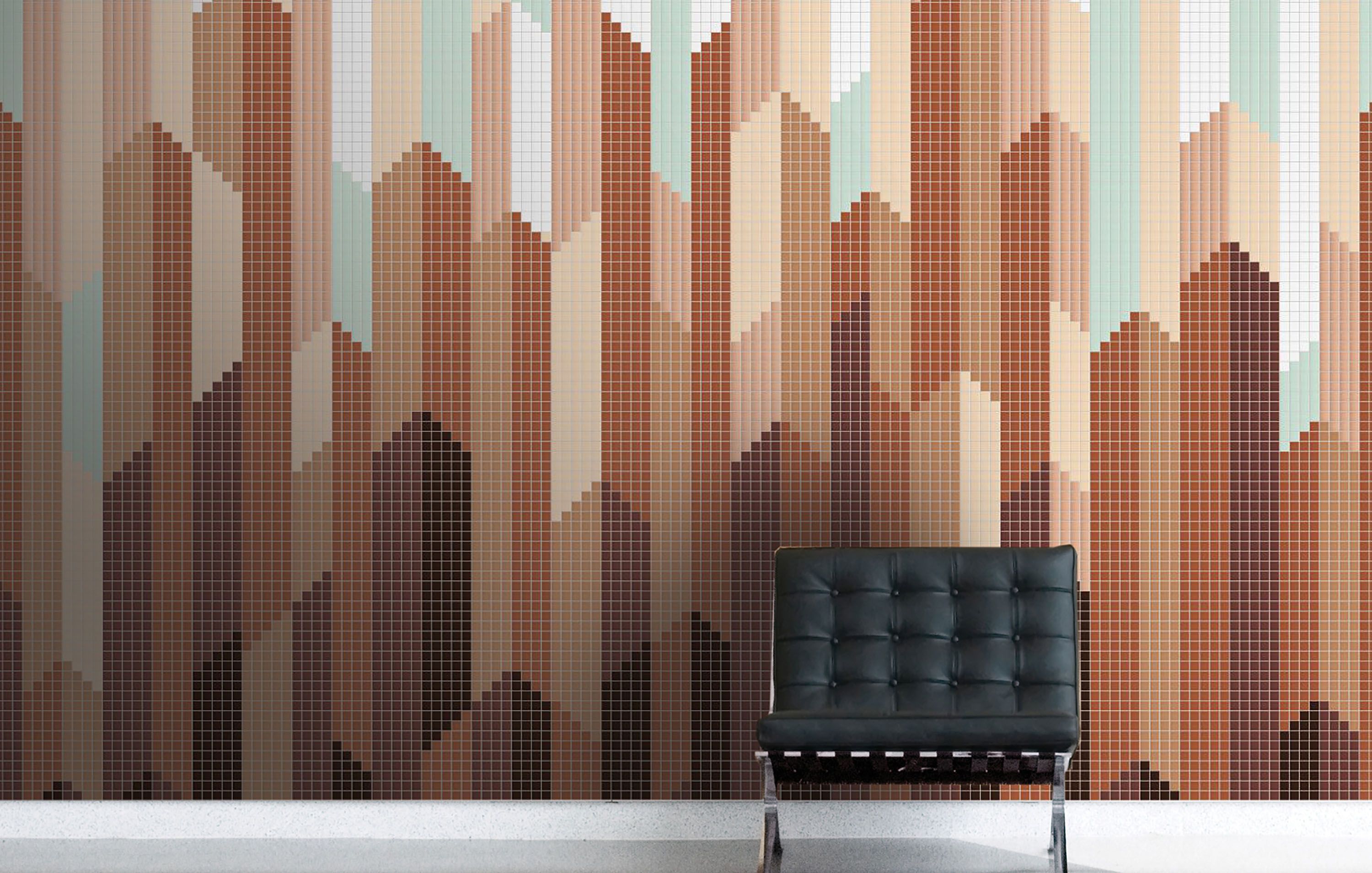
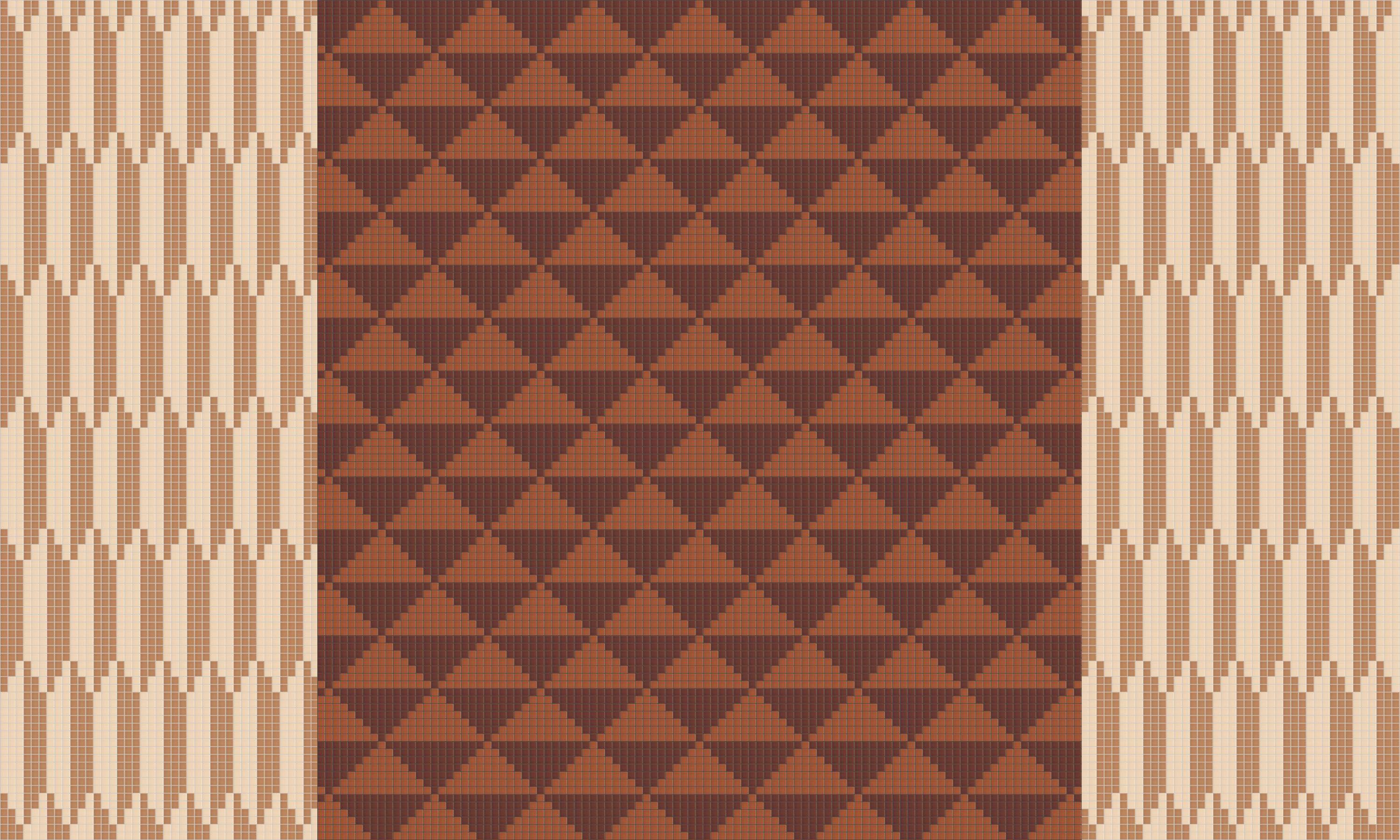
If you would like to use the Verge Collection by Artaic on your next project, please contact your Architectural Sales Consultant and Design Services team.
Later that evening, we were invited to Artaic’s Design ‘N Gather reception held at The NoMad Hotel where they revealed the winner of the Design ‘N Gather design competition. This year’s Design ‘N Gather competition focused on creating a design for the ceiling and walls of The NoMad’s Cupola. The Cupola is used for private dining events and is a very unique and beautiful space in NYC. The hotel itself is a beauty, I would highly recommend visiting it and having a cocktail in the Library, it’s a stunning space. I was very excited to see the Cupola since it is reserved for private events.
The winning design is called ‘Starry Nights’ by Kavitha Iyer. Kavitha Iyer ‘wanted to bring the outdoors in, evoking the experience of a star-lit dinner inside the walls of the Cupola. It’s a simulation – as if you are dining outside surrounded by trees with the city’s lights peeking through.’
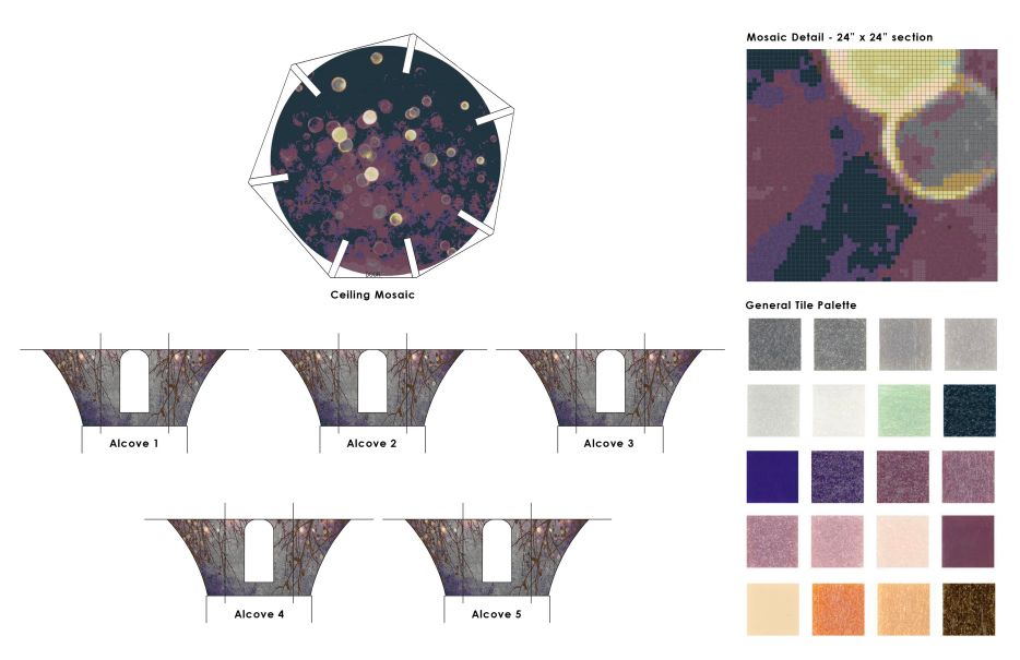
So my fellow designers, check out the Design ‘N Gather competition next year. I can’t wait to hear where it will be next. It is open to designers, artists, pretty much anyone who would like to create a design for a cool space. You’ll use a combination of Photoshop and Artaic’s Tylist software to convert your design into a mosaic.
If you’re looking for more tile inspiration, check out my new Instagram page called erins_picks.
Until next time…
E