Welcome to a special edition of Erin’s Picks! As you may have heard (or maybe you haven’t) we’ve been working on a Top Secret Project – Creative Curations by Erin! (and yup, that’s me!)
Creative Curations by Erin is a new product line within the Creative Materials umbrella. The collections you will see within this new product line won’t fall under specific trends like you’ve seen with our Spring Summer and Fall Winter Featured Collections, these collections will be that bespoke element – that becomes the jewelry or eye candy or Instagram-able element within your design. I’m excited to share these collections with you today and to talk about my favorite details of each one in a multi-part blog, but before I do I have one more thing to share, and we could not be more excited about this!
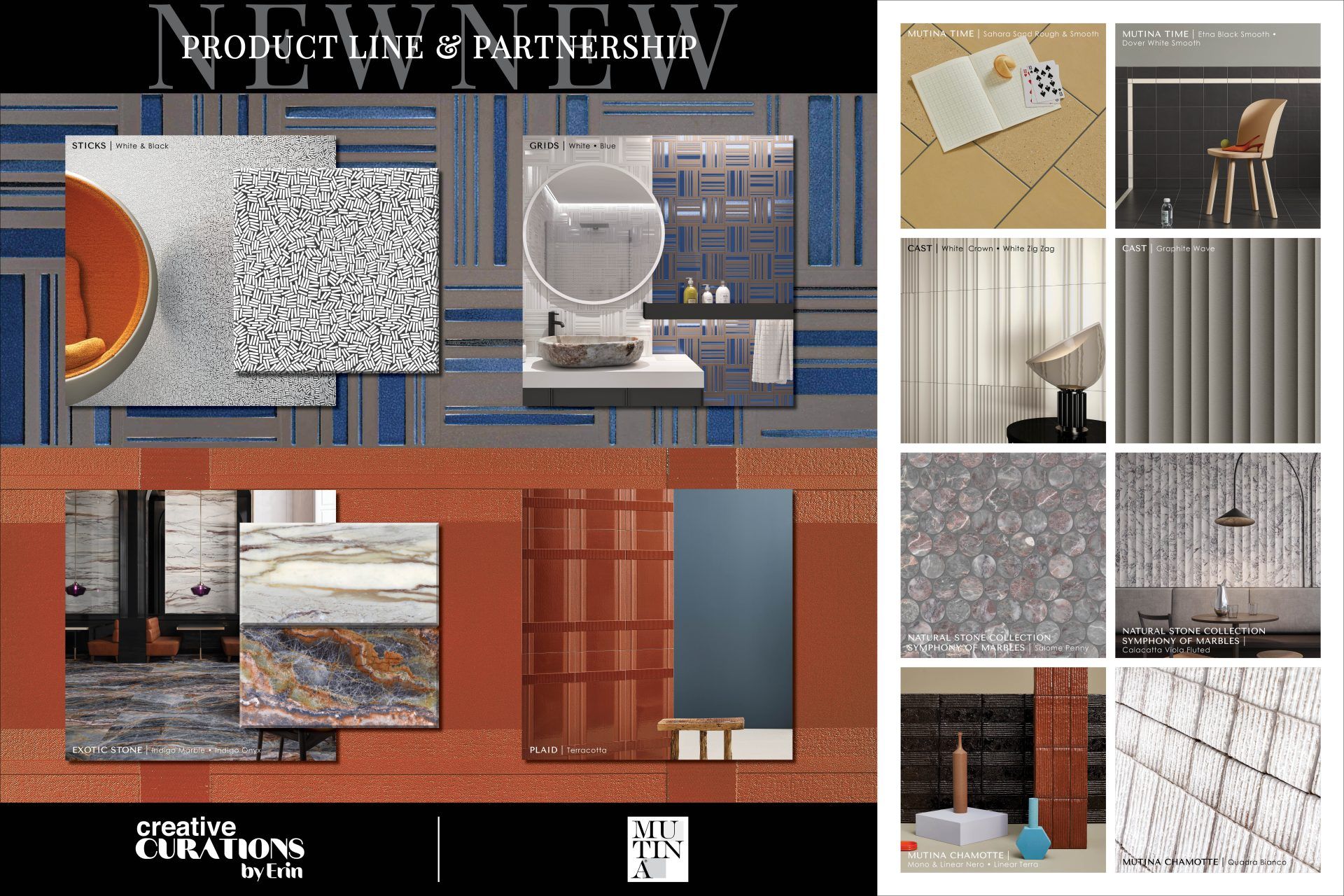
We have a new partnership with Mutina !! You will see two new collections from Mutina within the Creative Curations by Erin product line. Please join me in taking a look at the collection theme and the details that define these new collections.
“Creative Curations by Erin – A blend of exclusive collections, elevated design, and artistry for unique spaces and visions. The Creative Curations product line is thoughtfully selected by trusted interior designer Erin DeMuth, renowned for her Erin’s Picks blog, ability to identify trends, and intricate knowledge of surface materials.
Creative Curations is designed to evoke inspiration for spaces such as exclusive retail, luxury, hospitality, fine dining, exclusive and private clubs, boutique corporate offices, luxury amenities, bespoke lobbies, leisure spaces, and more!”
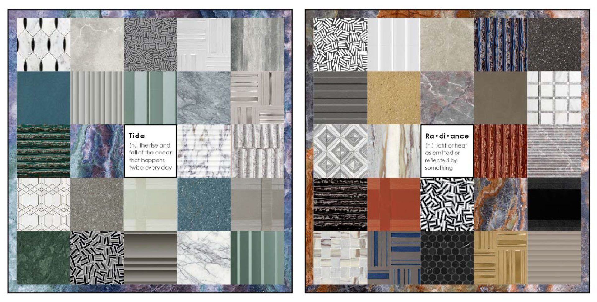
When I started creating the collection palettes for Creative Curations by Erin, my brain immediately began dividing the collections into these two combinations/themes shown below – Tide & Radiance. They feel like polar opposites to me – Tide is a very calm and soothing quality, while Radiance has a bold, dynamic energy to it. And maybe I’m drawn to these because they are reflections some elements of my life right now, my personal life vs. my professional life. My professional life feels like the Radiance palette where I want to keep growing and do more within Design Services and our Product Launches to help and education the design community, which is definitely a passion of mine. My personal life feels more aligned (or at least I’m trying to align it) to the Tide palette because I’ve started to turn my home into that mental break I need from the daily grind, and the things that are helping most with that is slowly starting to decorate our new home and creating some new gardens from scratch. The gardens at times have been overwhelming, but the thing that is starting to ground me and help me focus on my selections is my color theory knowledge of complementary colors. Ever since high school art class I’ve always leaned towards the yellow/purple pairing, so I used that as my base color palette for my pollinators garden, and I’m very excited to see how it grows and comes together.
I love the emotional ties color can have on a person. To this day, the types of stories we can tell with the colors we select still amaze me. I hope the collection themes I’ve created below evoke a certain emotion within you and helps guide your next design story.
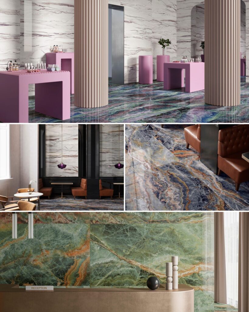
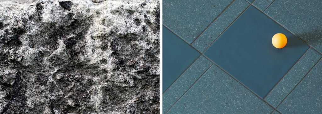
CONCEPT – Inspired by the cosmos and this is translated into two visuals – onyx and marble.
“An explosion of color is found within the onyx visual capturing the bold and beautiful colors found in the cosmos, while the marble visual is more tranquil, it’s color can be found radiating through the marble veining and contrasts against its white background.”
I love the wow factor of this collection; it’s so stunning IRL and unlike anything you’ve seen before! I can’t wait to see this on the floors of a boutique hotel or the feature wall of an office lobby – it will definitely be eye catching!

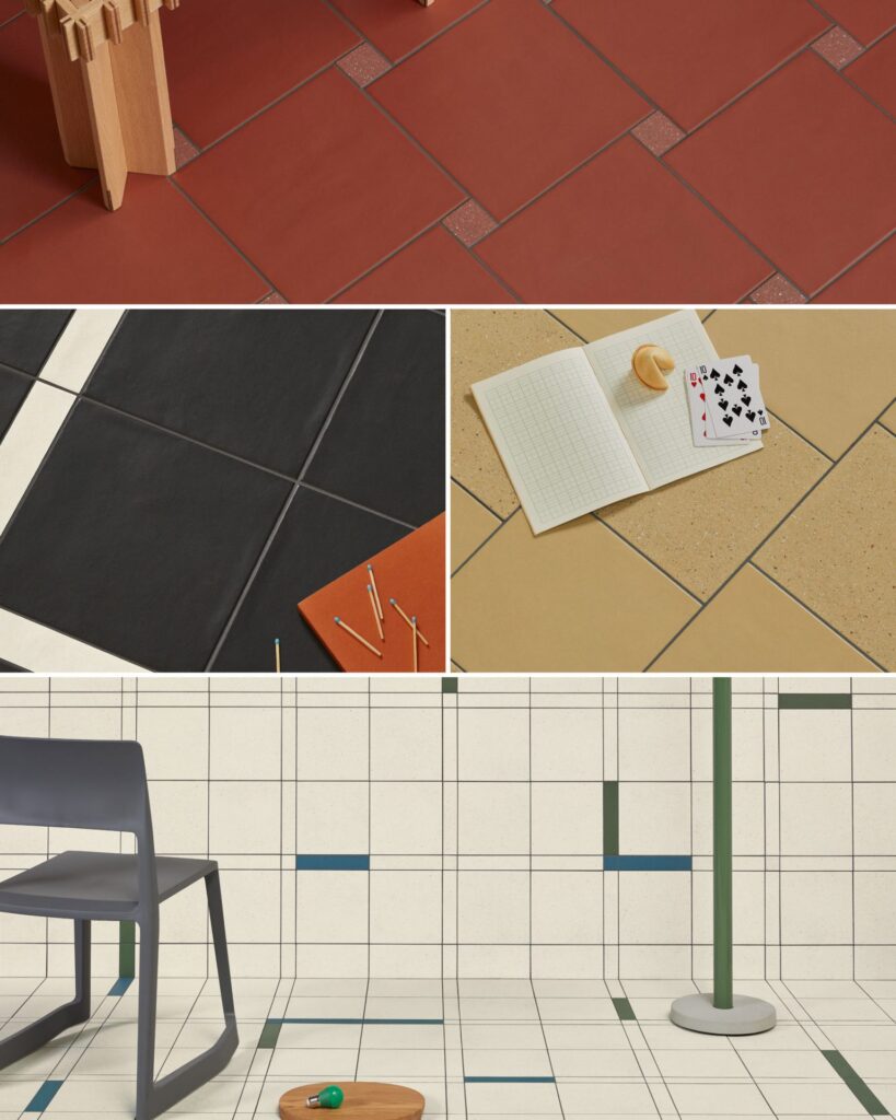
“The concept of time has actually been a recurring theme in several of our collections. Time delves into the manner in which objects, over time, either weather and acquire a rough texture due to exposure to the elements or interact with human, becoming smoother through the years.” – Barber & Osgerby
I love the story and thought behind this collection. I’ve always found it interesting how materials weather from manufactured or natural exposure. I went down a deep rabbit hole researching this and found the NIST (National Institute of Standards and Technology) has a 70 year old stone test wall in Gaithersburg, MD, it’s the world’s longest-running weathering experiment for stone samples. It’s very impressive to see what happens to a material like stone over time.
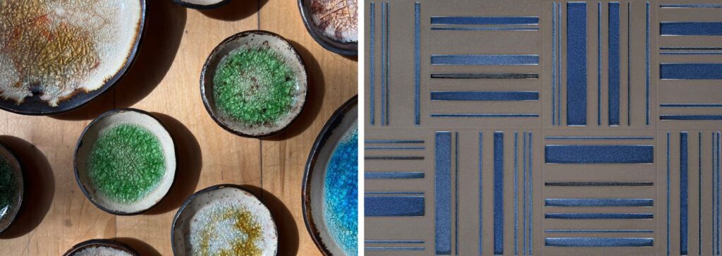
CONCEPT—A traditional weaving pattern is made contemporary with beautiful metallic finishes and traditional pottery techniques, like pouring glass onto clay, which transforms an otherwise uniform glaze into a crackled masterpiece.
I love pottery and stumbled upon this style at Pearl Grant Richmans in Albany, where they curate pottery, woodwork, etc., from artisans. My favorite piece the store carries are a set of coasters with the poured glass, the glass adds so much depth to the pieces and enhances the character of the glaze. I was really drawn to Grids for capturing this same technique and adding this extra layer of depth to its blue and green colorways.
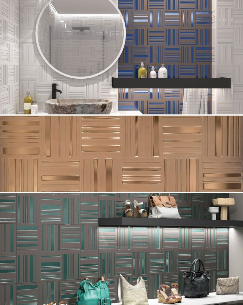
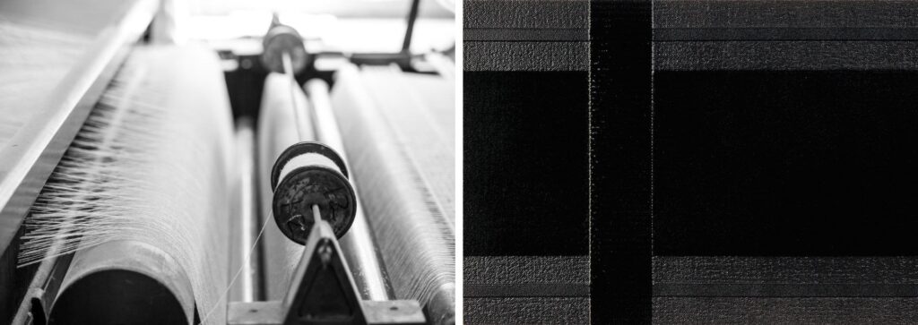
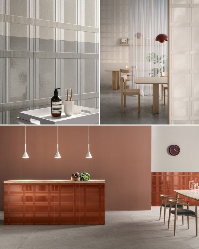
CONCEPT – A new geometry of vertical and horizontal planes becomes as soft as cloth, and a refined weave and weft takes shape.
The deconstructed weave of Plaid is such a cool concept. I love how they extrude the layers of the weave and enhance it with a variety of finishes and textures.
If you would like to see these collection and learn more about them, please contact your local A&D Consultant. You can also check out the Instagram Live I hosted on Tuesday, June 4th on Creative Materials’ page – @creativematerialscorp – where I dived into some of my favorite details from these collections.
Follow me on IG @creativecurations_erin
Until next time…
E