Out With the Old, In With the New…
That seems to be the trend this time of year, so in keeping with that theme, I’m going to show you some panels I designed for our 2018 Spring Summer Collection that we’ll be retiring soon to make way for our very cool 2019 Spring-Summer collection. You may remember I did a similar reveal in August of our latest 2018 Fall Winter Collection. These panels from our 2018 Spring Summer Collection will always have a special place in my heart. They were fun ones to design and install. Even though the panels are being retired, the collections are not! Read on for a refresher on these which were hand-selected by yours truly, and are still among my favorites. This series has a play on angles, geometry, and designs within the design.
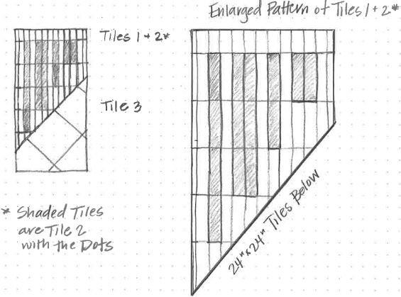
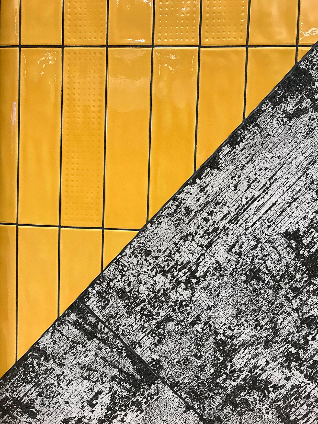
This first one is my favorite featuring Effervescent Yellow and Fizzy Yellow and Smolder Deconstructed Black. I love the subtle design of the Fizzy Yellow and the fun patterns that can be made within the yellow field. I also played with a heavy diagonal of Deconstructed Black cutting across Effervescent because sometimes you need to change it up – horizontal lines get boring. I also modified the Fizzy Yellow pattern to play off the angle of the Deconstructed Black. The last design element I added was a strong high contrasting black grout to pop each piece of yellow tile. I will definitely miss seeing this yellow every morning when I enter the lobby at Creative’s headquarters.
Grout color used with Effervescent and Smolder: Mapei 10 Black
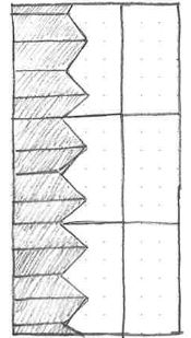
This second panel is a very close second to the Effervescent + Smolder panel; it features Cascade Black Medium Chevron and Plywood Beige. This design actually changed a bit from my original concept because I forgot to order the Medium Left + Right Chevrons… oops! (Don’t make the same mistake as me!) As a result, I couldn’t make the arrow that I originally wanted to cut into the plywood, so it took a bit of shifting, rotating, and reworking with our tile guy, Jim, to come up with the current design and I’m very happy with the final result! I love the way the larger angles of the chevron cuts into the plywood. I also love the contrast of a traditional material against a processed/engineered material, the contrast of colors (hint: you will probably see this in the next panel too), and the contrast of the textural surfaces: natural cleft vs. particle-like surface. So happy with how this one turned out!
Grout color used with Cascade: Mapei 10 Black | Grout color used with Plywood: Mapei 39 Ivory
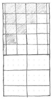
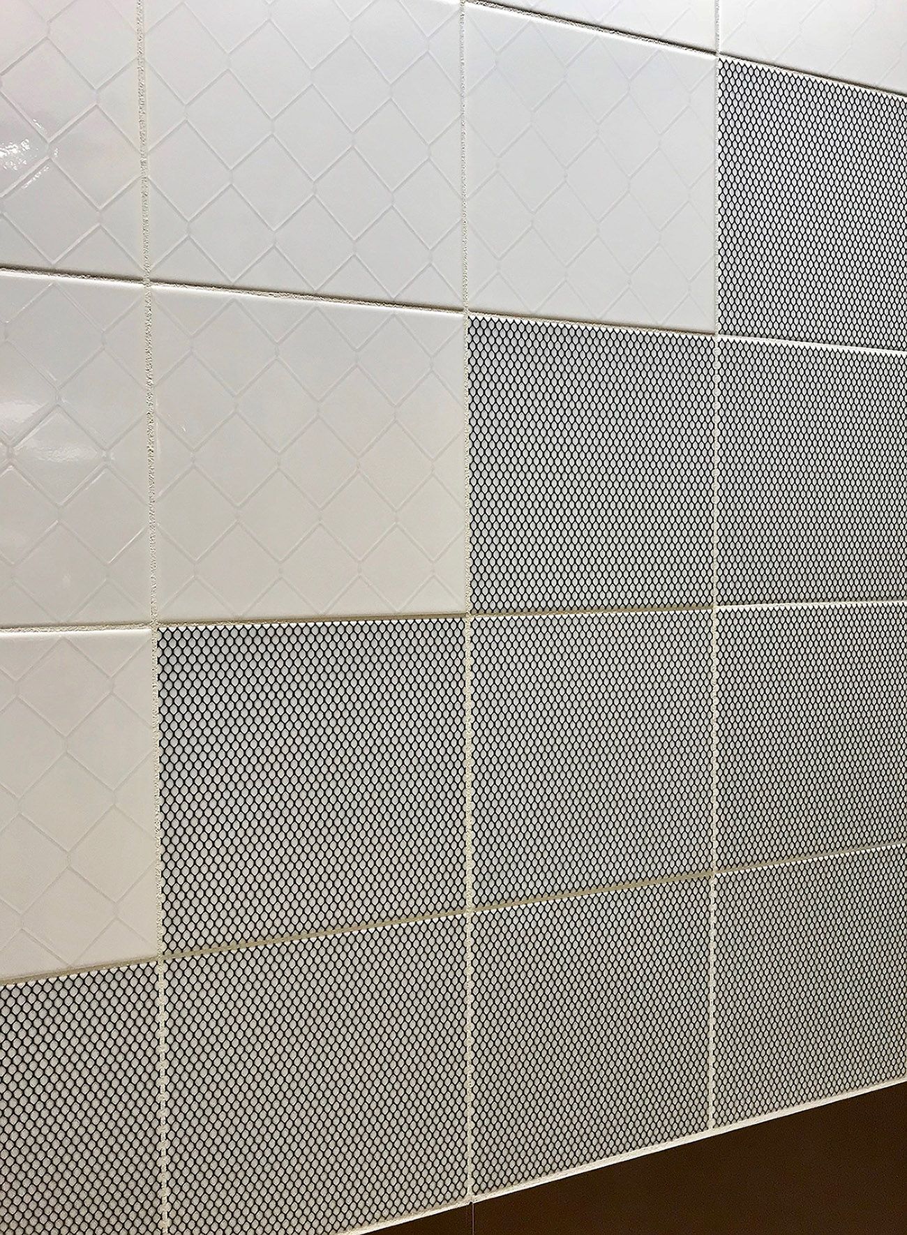
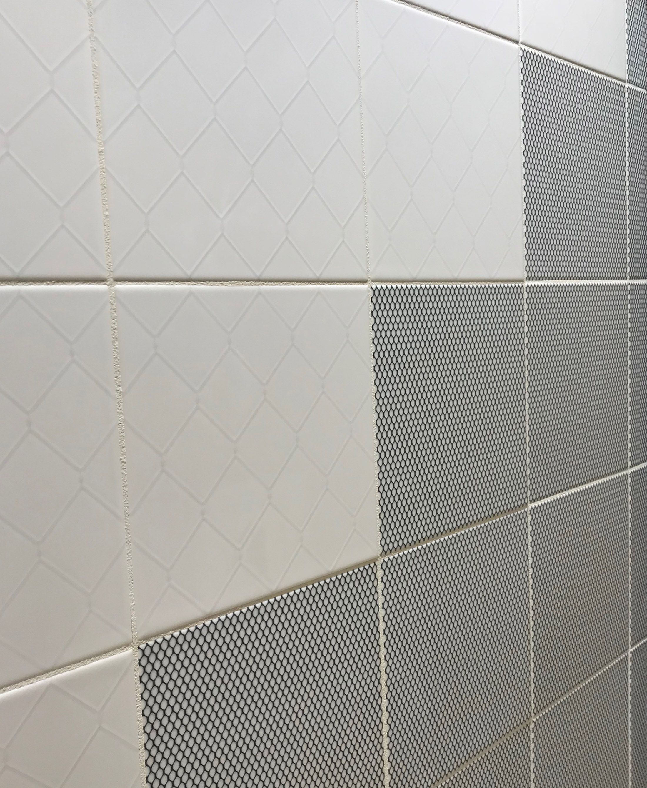
The final panel, which I had hoped would be way cooler, unfortunately, is lacking a little ‘Je ne sais quoi.’ This panel features Galvanized White and Black and White Micro alongside Walkway Red. I really wanted to play with a pattern within a pattern concept with the Galvanized, but I feel like the stepped angle wasn’t successful. I think the White and the Micro should have been contrasted with a sharp diagonal, and I also wasn’t happy with my grout color selection. I wish I had done a higher contrasting grout like a dark gray or even black within the Black and White Micro, and left the white within the White Micro only. I’m also not completely in love with the Red adjacent to the Micros. In hindsight, I think the grays or blacks would have been a better pairing with the Red. What do you think?
Grout color used with Galvanized: Mapei 00 White | Grout color used with Walkway: Mapei 114 Mahogany
Thank you for taking the time to bid the 2018 Spring Summer Panels adieu! I’m very excited to show you the new designs and concepts for the 2019 Spring Summer Collection which will be coming out very soon!! And one more thing, we would love to see what you’re creating with our Featured Collections. Whether you’re combining materials from the same collections or mixing and matching different collections, please tag us on social media @CreativeMaterialsCorp #CreativeMaterialsCorp! We would love to see what you’re creating with Creative Materials!
Until next time…
E