HAPPY SUMMER!
This month, and speaking of this month – where did it go? I honestly can’t believe it’s the end of July already. I feel like a kid who just saw the back to school section at Target – Summer just started, didn’t it?! Part of the reason it flew by so quickly for us is that we’ve been busy working on our new 2018 Fall Winter Collection that we will be releasing in a couple of weeks.
As you may recall in the May and June Erin’s Picks, I discussed the looks and trends we saw at Coverings Atlanta. I also got the opportunity to write an article for Floor Focus’s Design Ovations (thank you Floor Focus!), where I discussed the shift in the color palette at Coverings and the tile collections that reflected that.
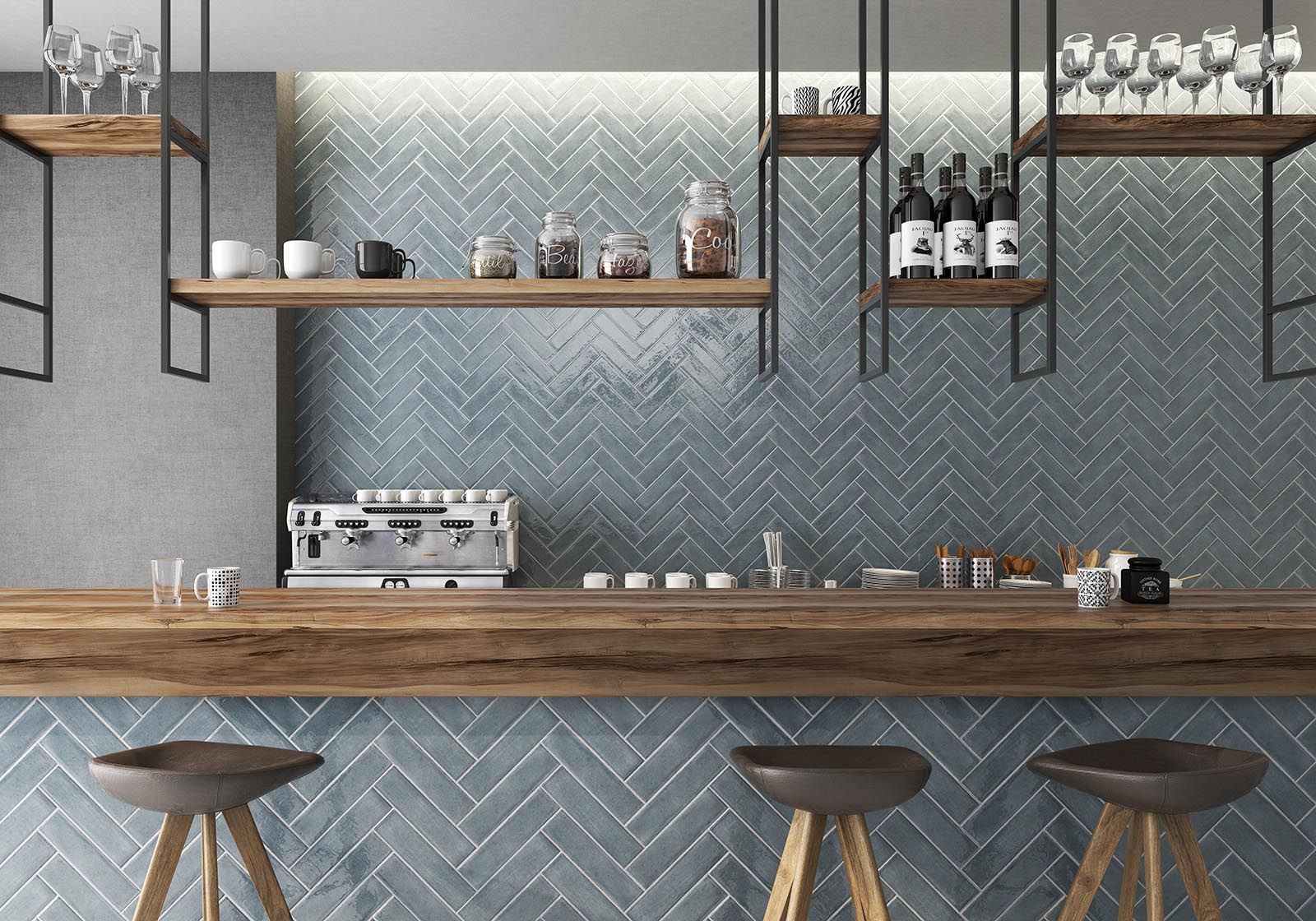
So I’ve talked about the looks and trends, shown pictures of collections that reflect said looks and trends… by now you’re probably wondering, what have we selected?! Well you’re in luck because we are giving you a special preview of Creative Materials’ 2018 Fall Winter Collection. The tile mood board/ tile palette shown below is just a sampling of looks we curated. You will see much more in just a couple of weeks.
The tile mood board is something I’ve started creating after our product team (myself included) reviews all the collections we saw at the show and compiles a list of what we envision for the next collection. The mood board allows us to see if our collections are well rounded – we want to provide you, the designer, with the best offerings as far as color and format are concerned. Looking at our collections as a whole allows us to see if there are any holes. We ask ourselves: Do we have a good range of size formats? Are there enough interesting textures and shapes? Is there a good color balance from colorful vs. neutral to warm vs. cool tones? A sea of grays is definitely on repeat at every show, but we know you’re not necessarily going to coat your entire design in gray, so our goal is provide you with products that are balanced, interesting and reflect the direction tile aesthetics are moving in. We select collections that are interesting enough to stand on their own, but also work well with other collections, hence the curated collection.
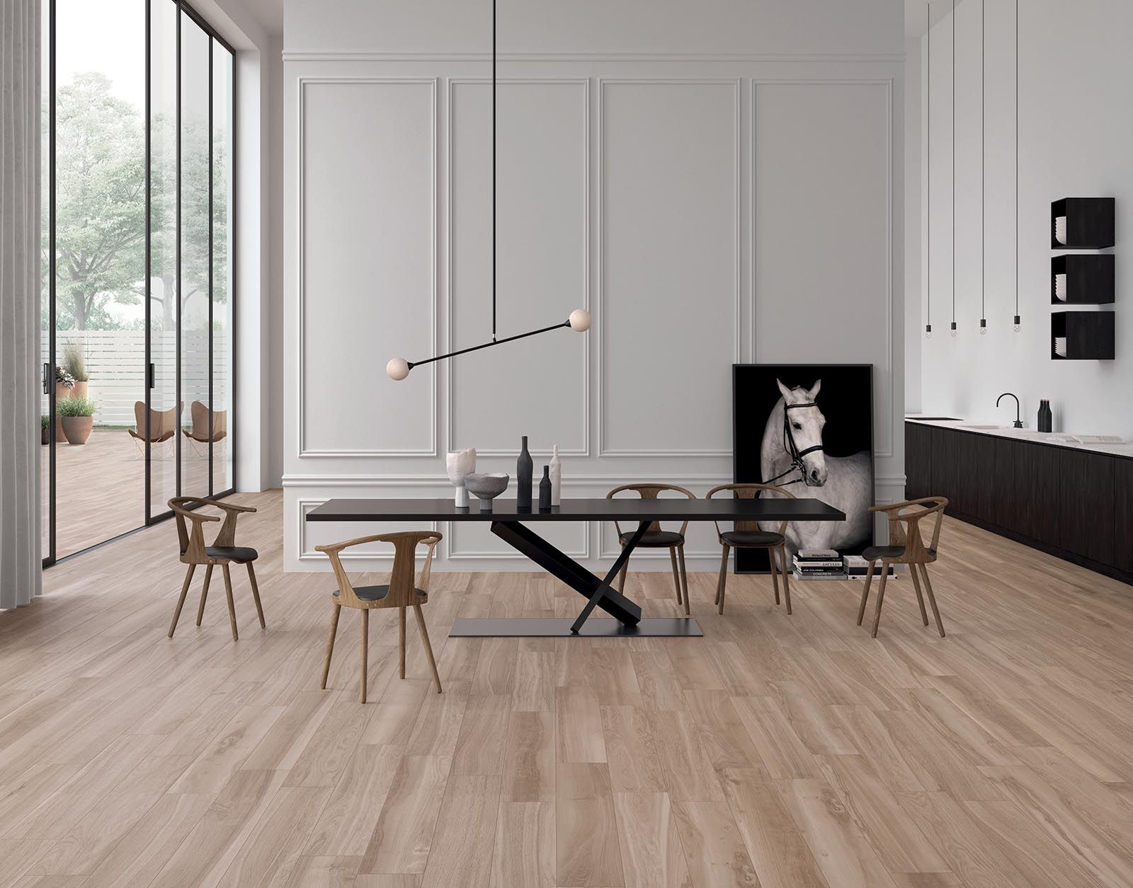
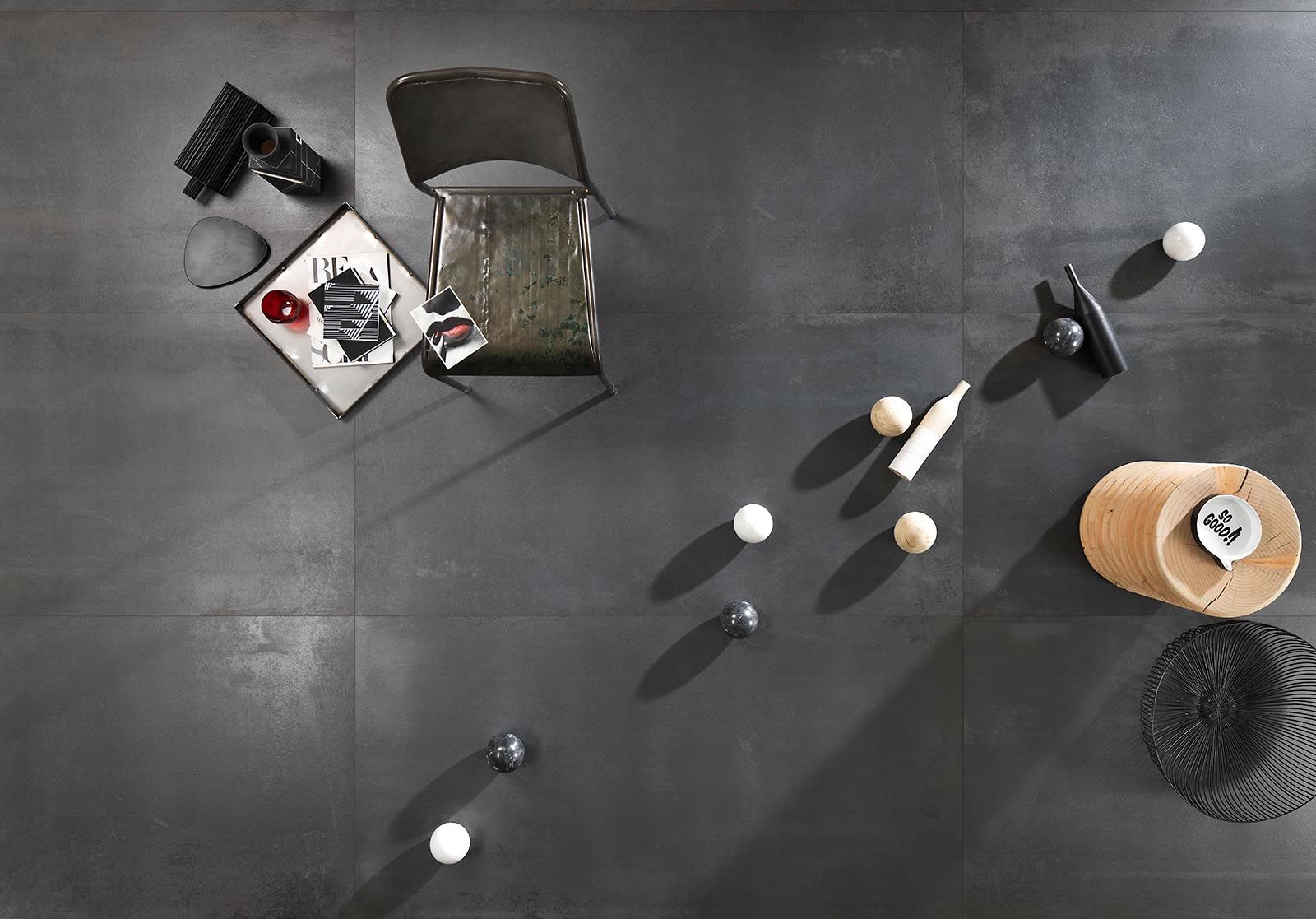
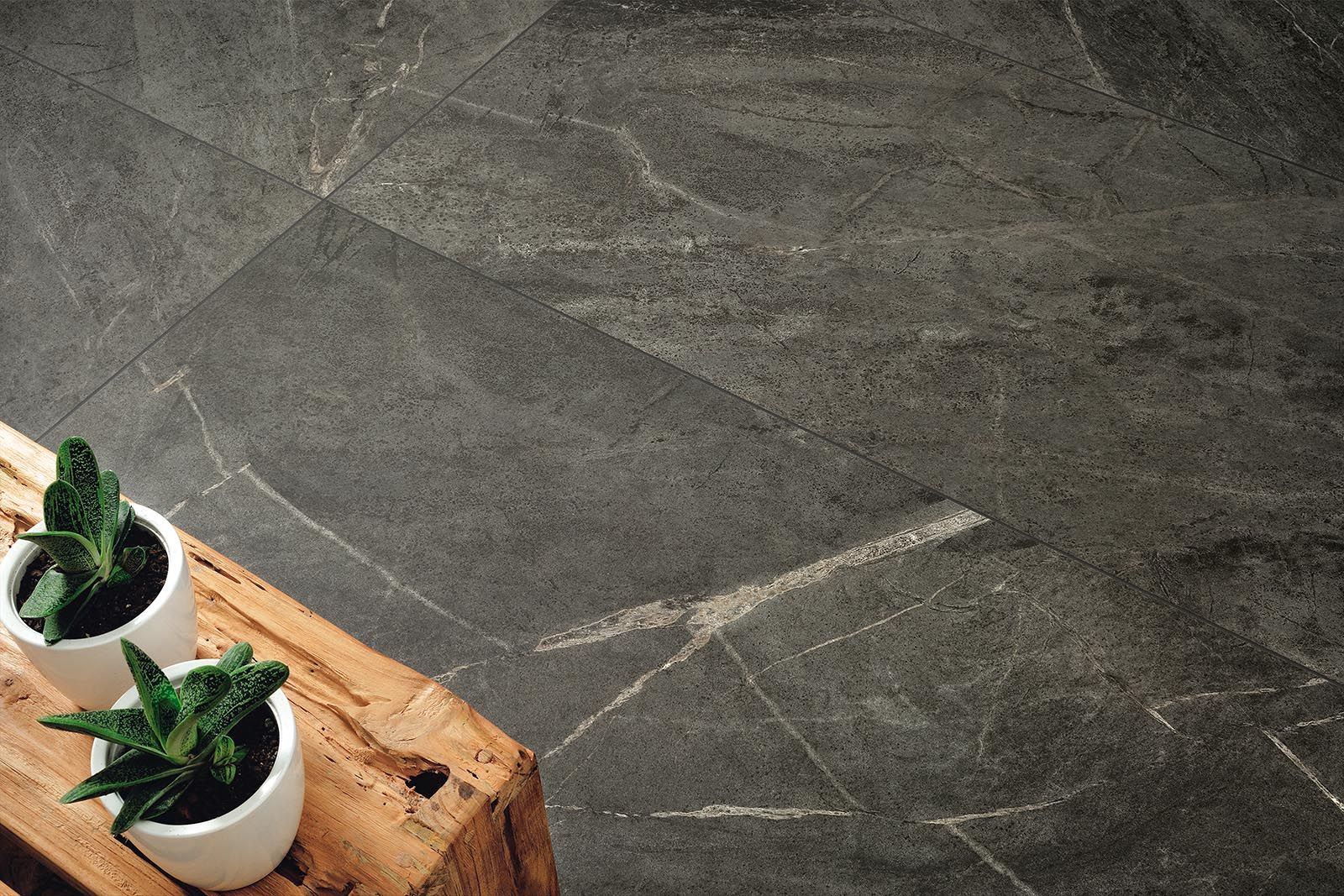
I know our architectural sales consultants are scheduling times to show the 2018 Fall/Winter Collection now, so feel free to reach out to get something on the calendar. If you don’t know who your consultant is, contact us here, and we’ll connect you.
Works Well With…
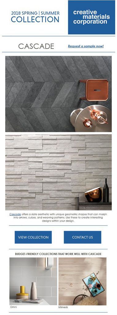
Cascade from our 2018 Spring Summer Collection: