… Out Like a Lamb?
Happy Spring!(?) I say that with hesitation because it was 35 degrees today in Albany and 2 days ago we had snow flurries. March has been a bit like a mutant lamb-lion this year with the snow, warm temperatures, down pours, lightning, but it’s looking like it will be out like a lamb on Thursday. *fingers crossed*
And that’s A-OK with me because I’m definitely ready for spring. I’m repotting my plant babies so they have more room to grow and I’ve started propagating new babies (or at least trying to.)
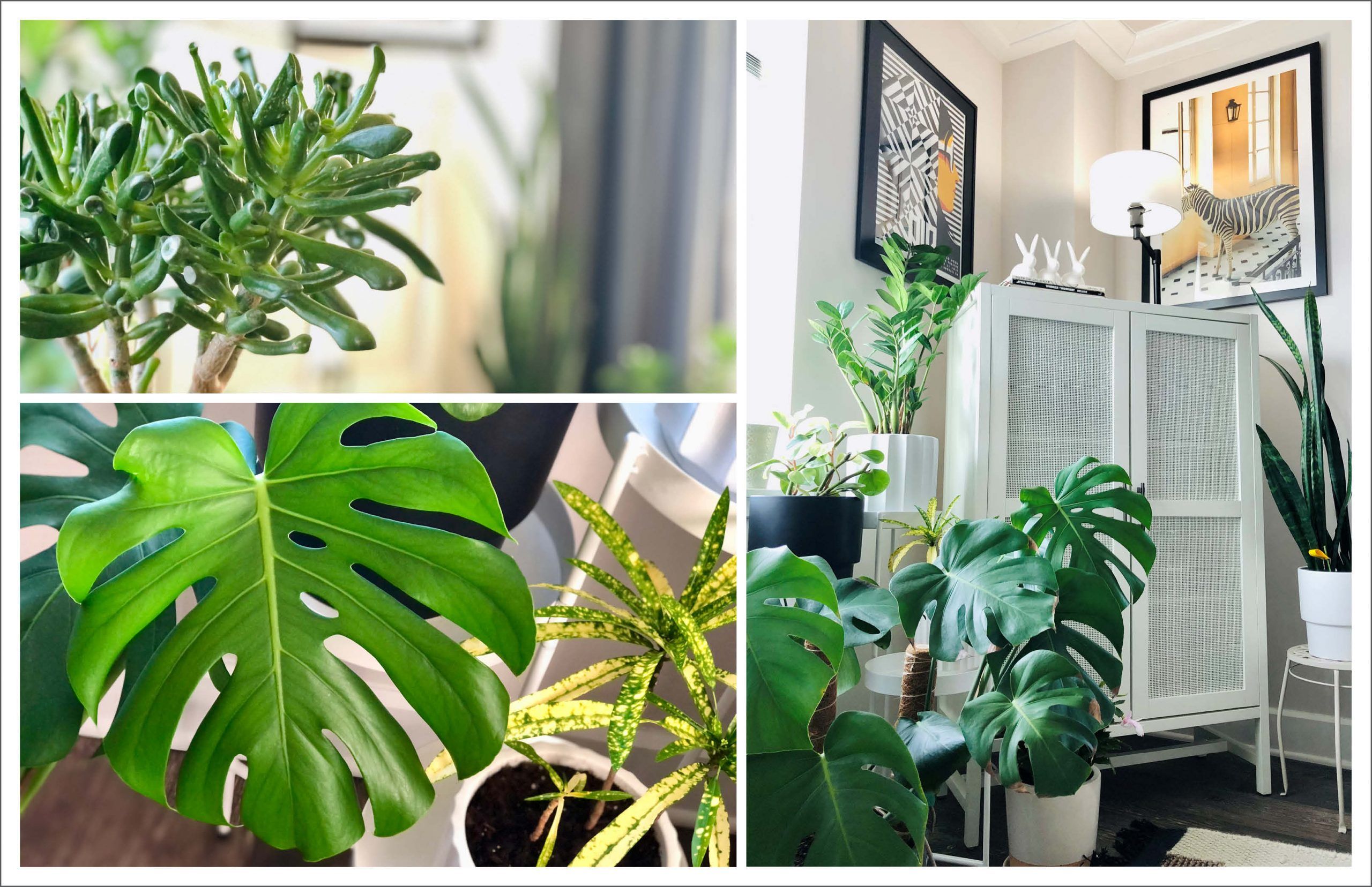
Image Credit: Lamb Lion Photo Illustration by Alberto Mier/CNN
2022 spring summer featured collections
We hope you’ve been enjoying our 2022 Spring Summer Featured Collections. It has been great seeing your faces IRL!! If you haven’t had the chance to see them yet, we will get you in touch with your local Architectural Sales Consultant so you can see the color stories for this season’s collections.
I’ve been creating some of my own color stories with these collections and really love the way the colors and visuals are working together. Which story is your favorite?
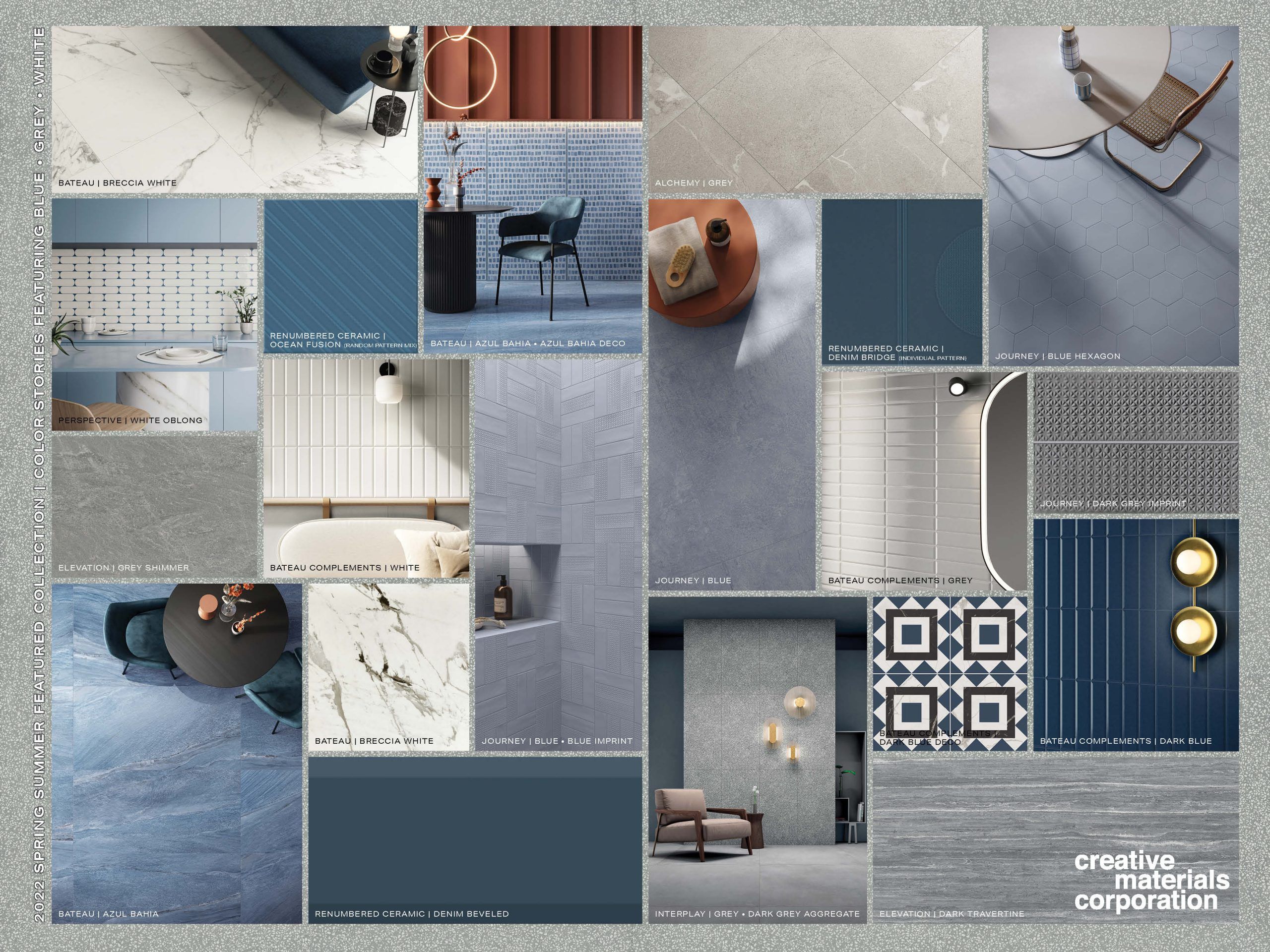
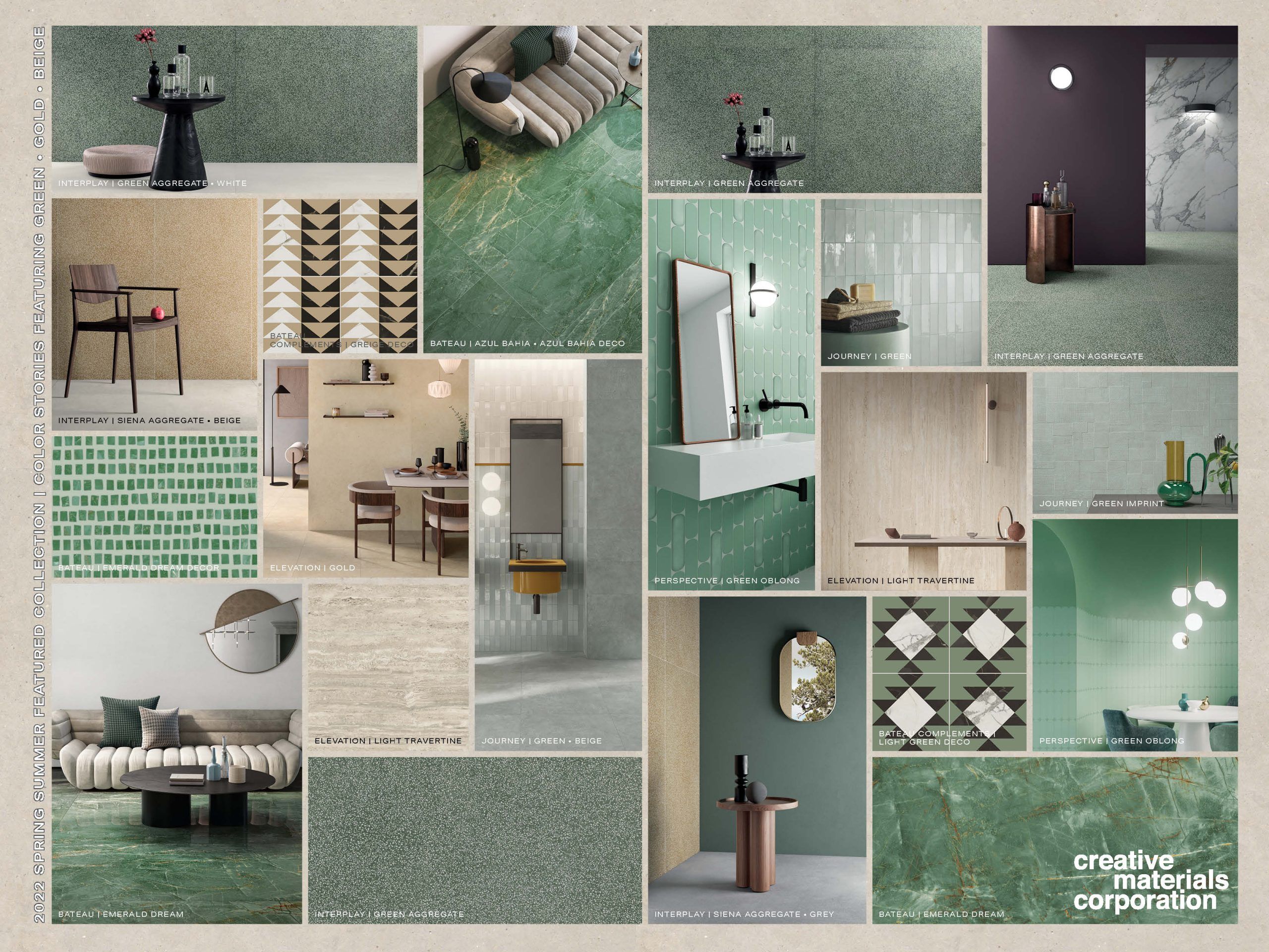
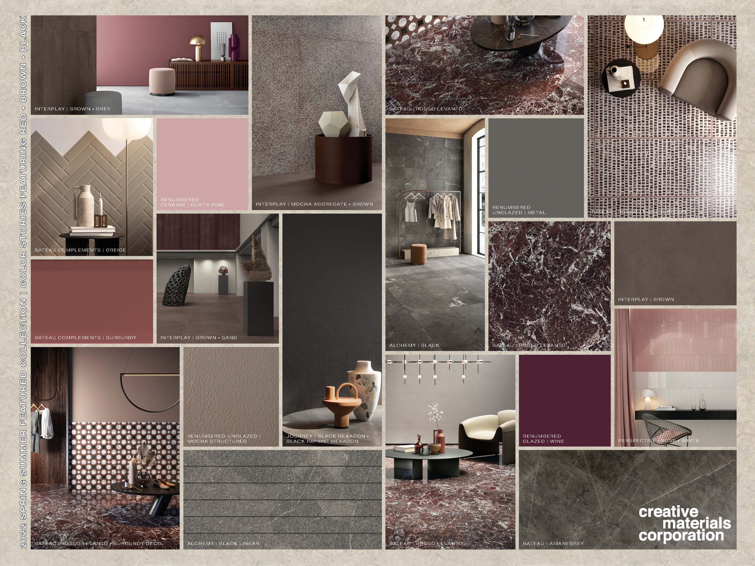
The color stories are a defining design element of these collections, but as I’ve been diving deeper into the collections I’ve been noticing some really unique and subtle details that I know fellow designers like you would appreciate.
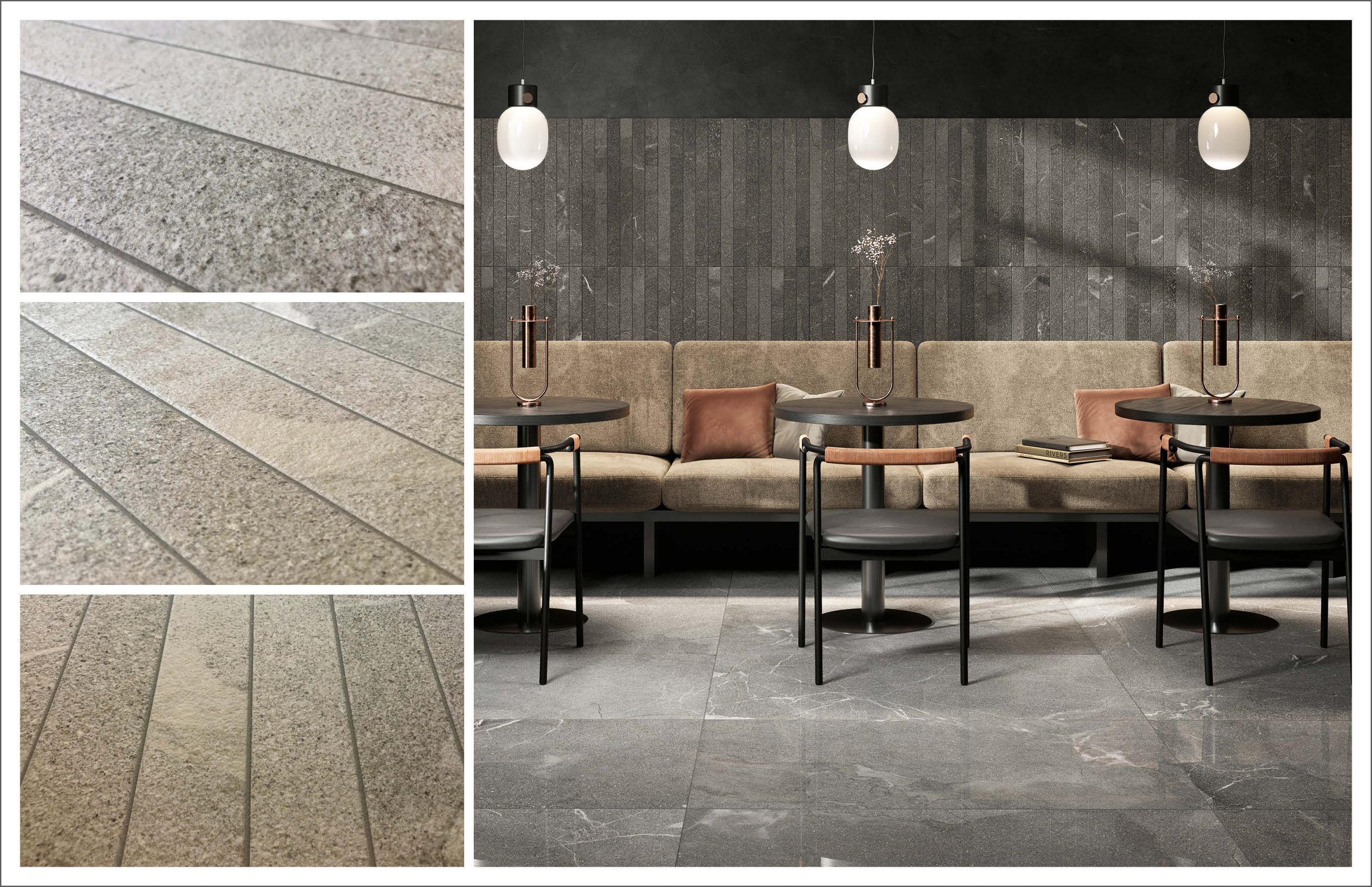
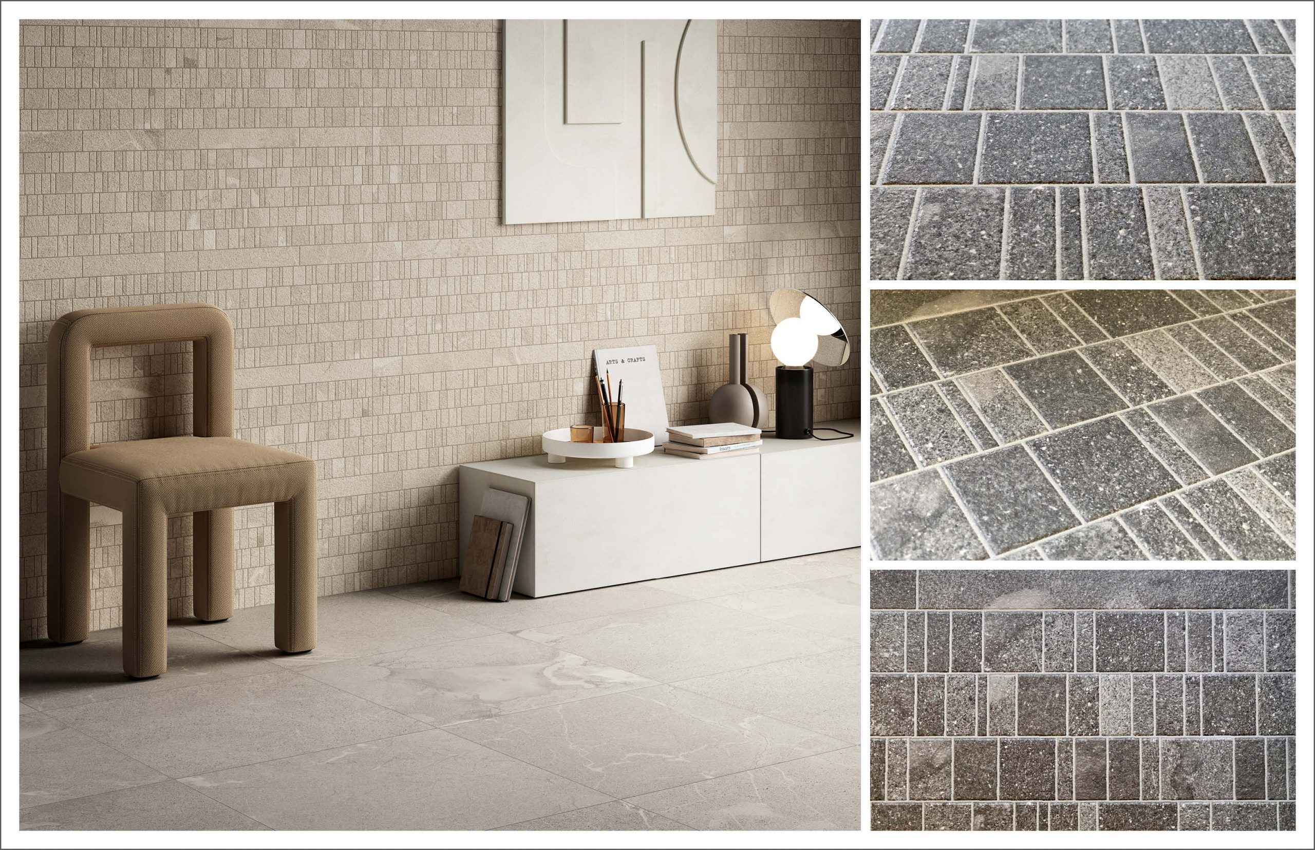
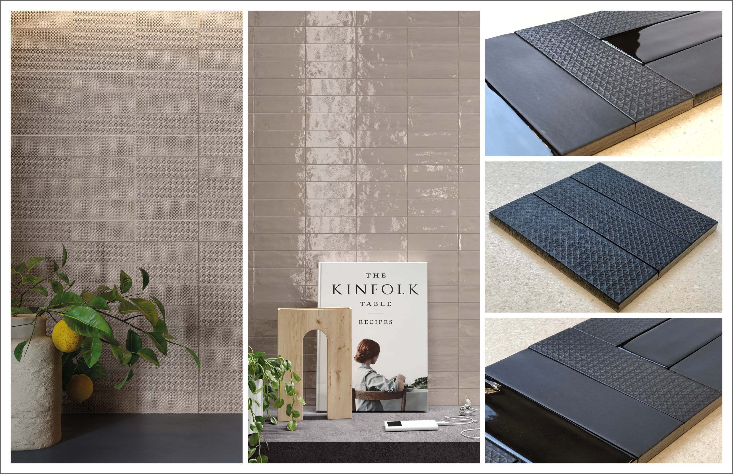
These details might not be obvious when you first see the collections, so I want to show you what I’ve found and like about these details. (FYI – I took the photographs shown below, they reflect the details I was trying to convey, but just note the colors are not exact.)
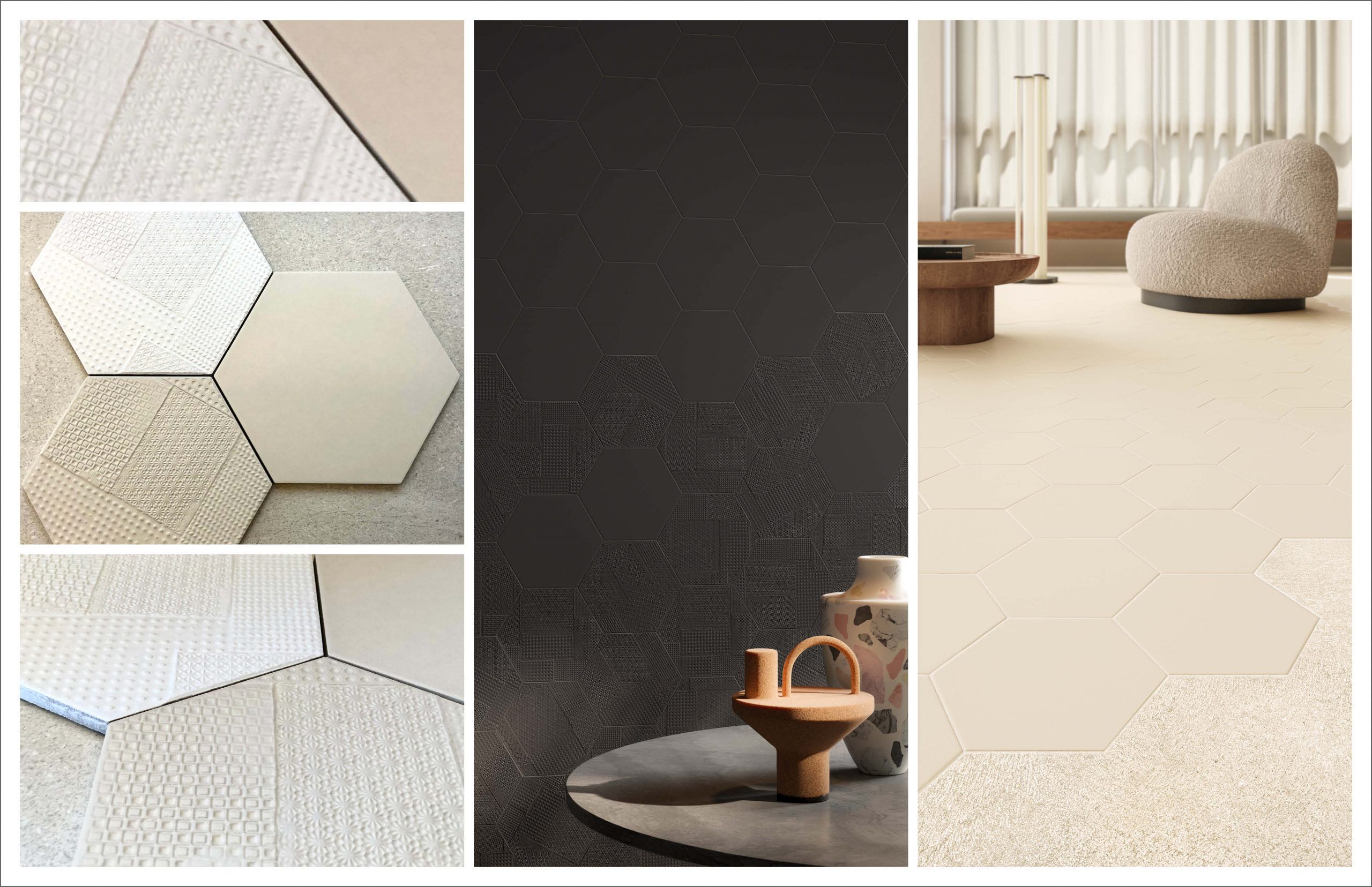
details to focus on: the stamp-like/mosaic-like effect of fragments and linear; the dark color laid in the stamped design and how that accentuates/ plays with the depth of the design
details to focus on: the imprint texture/design and how the pressure of the stamp impacts subtle quality and definition of the design
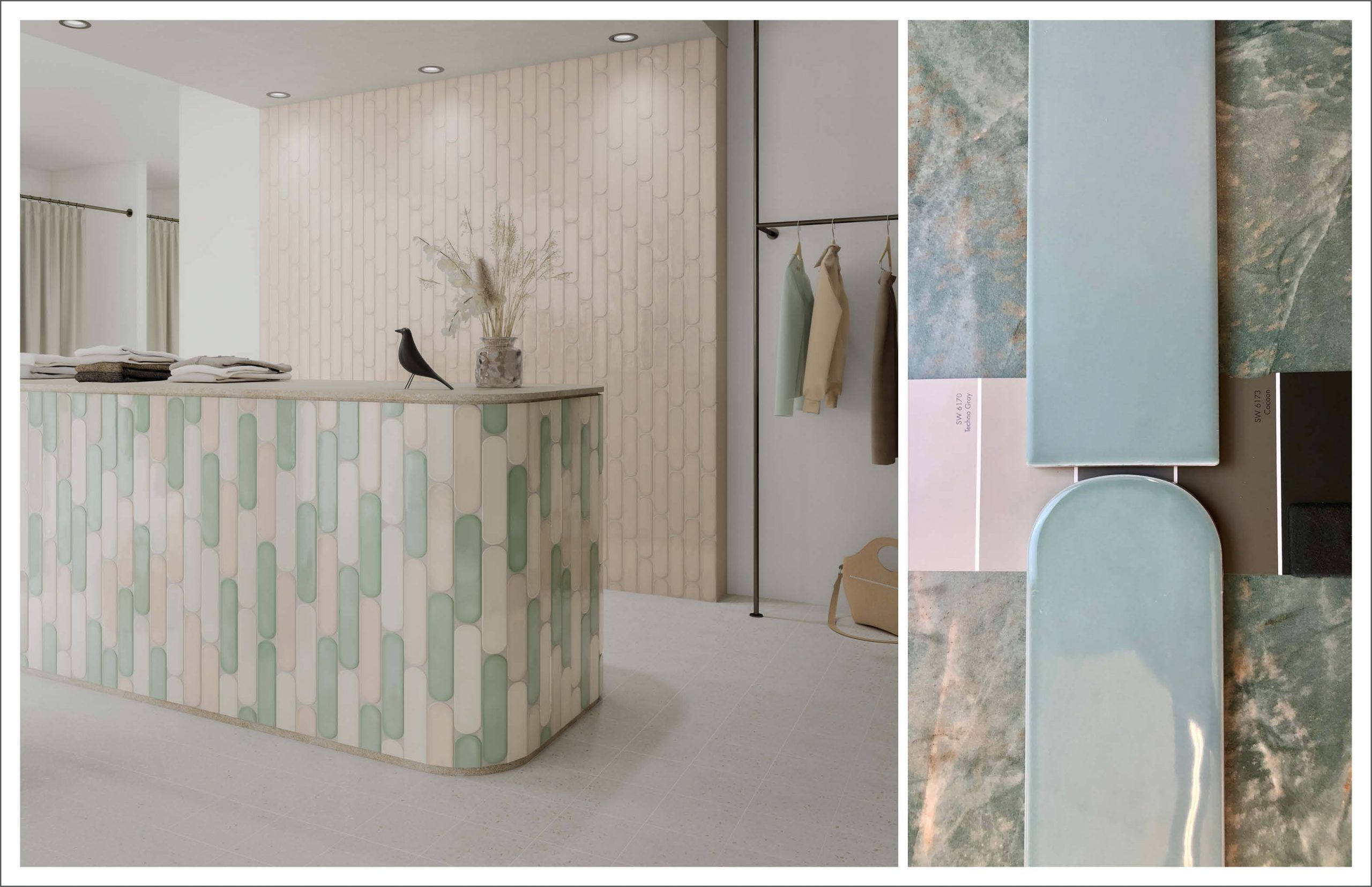
details to focus on: positive/negative space created by the oblong tile in stacked or staggered layouts; positive/negative space created when oblong and rectilinear tiles meet; and grout color!!
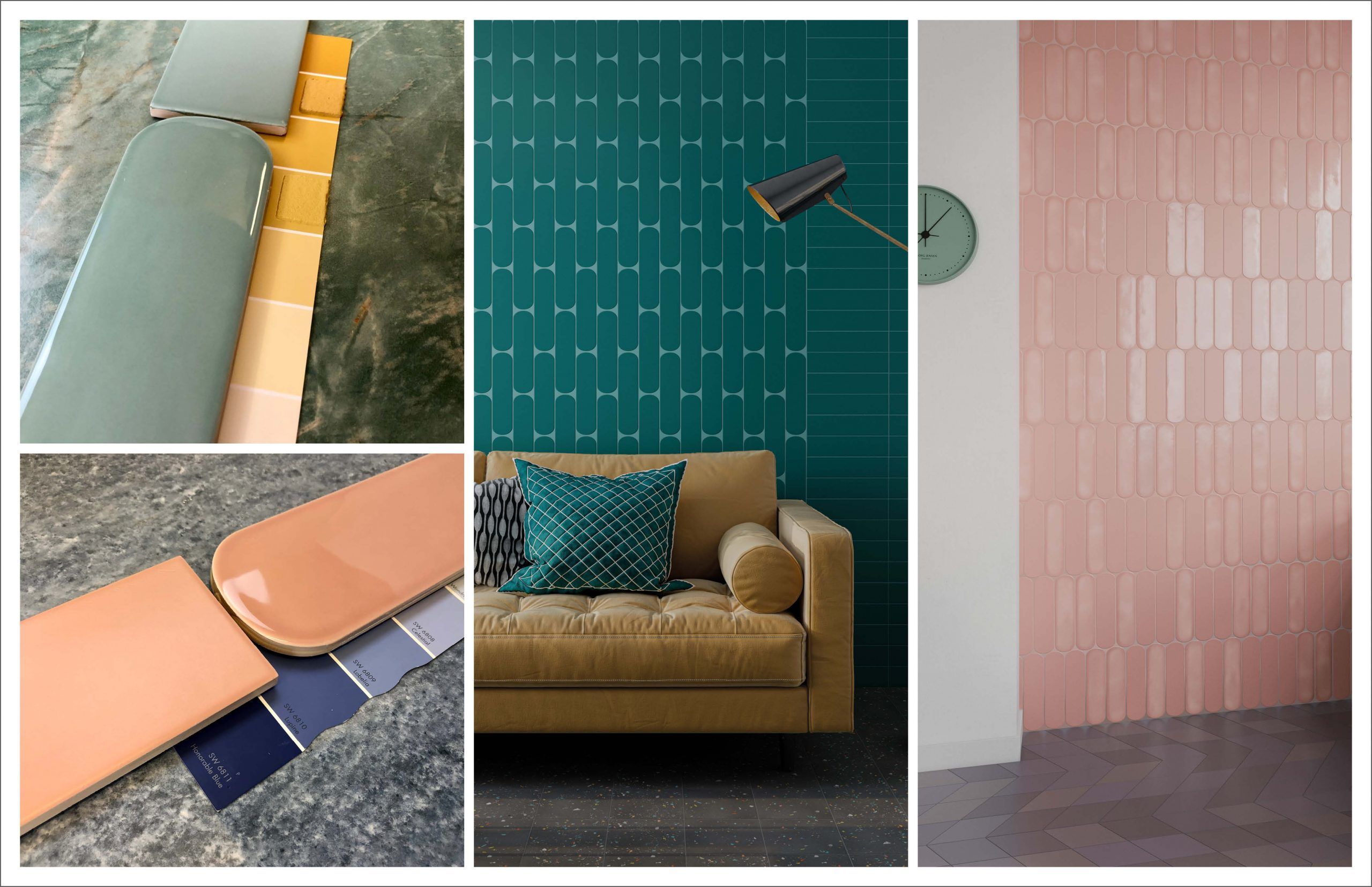
I hope the color stories and collection details from our 2022 Spring Summer Featured Collections have your design brains churning!
As always, please contact your local Creative Materials’ Architectural Sales Consultants or Design Services for any product and design related questions.
Until next time…
E
Looking for pattern ideas or technical assistance with pattern layouts? Creative Materials’ Design Services can help. Just click here and tell us about your project vision. We will take it from there.